Repository navigation
[$1000] Extra horizontal spacing (extra 13px on left and right side) on the resend link password page #17177


Description

If you haven’t already, check out our contributing guidelines for onboarding and email contributors@expensify.com to request to join our Slack channel!
Action Performed:
- Action Performed:
- Open App
- Go to the login page and create a new account
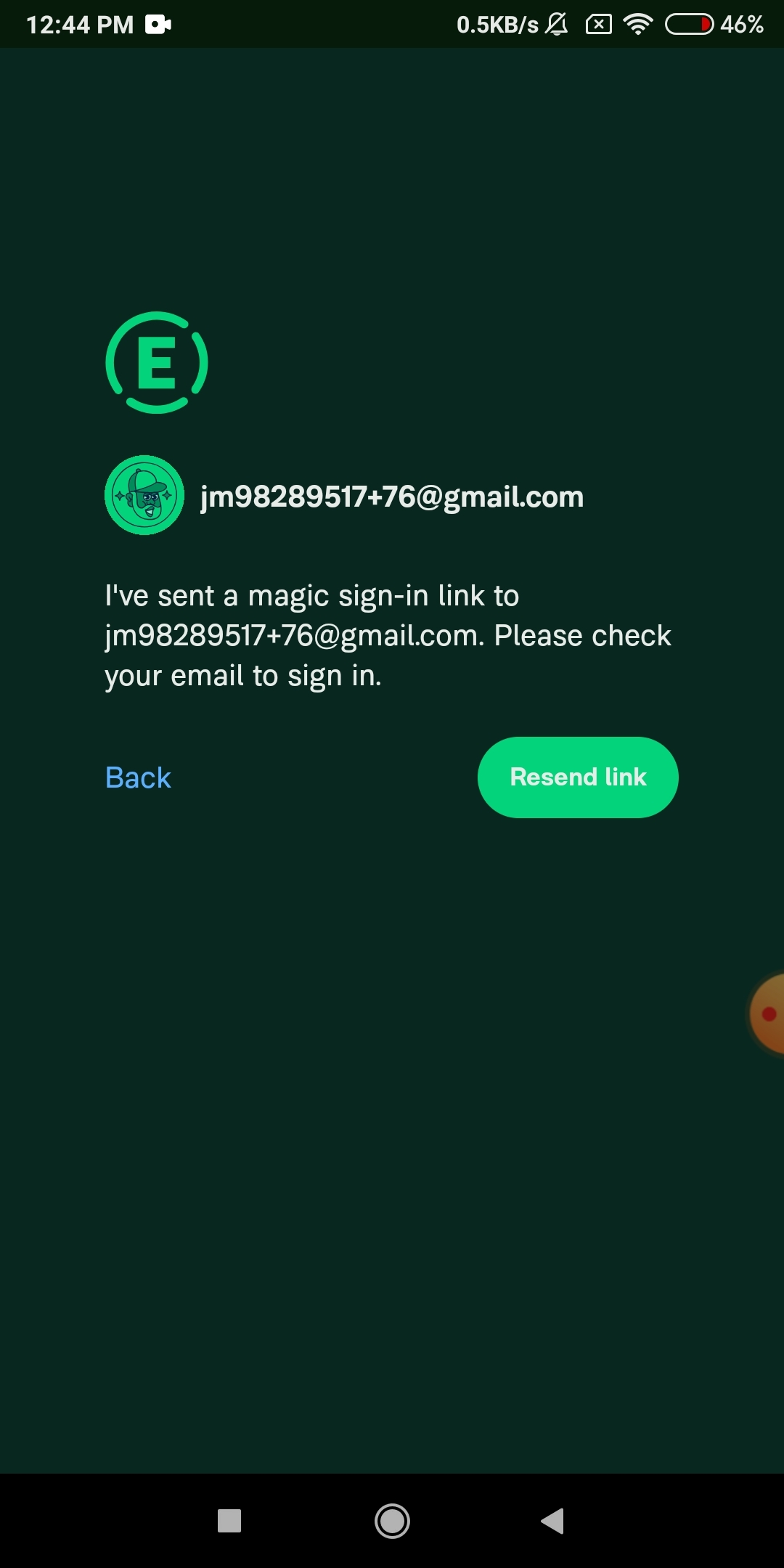
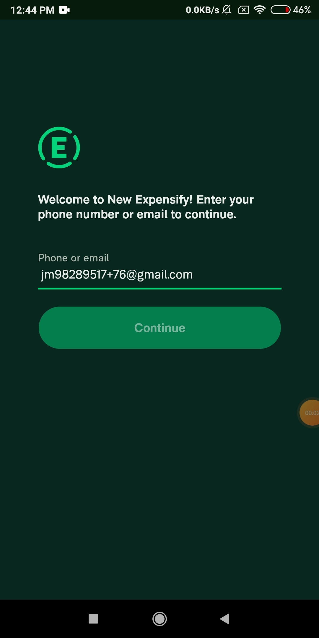
- It will navigate to resend link page
Expected Result:
Horizontal spacing should match with login and password page
Actual Result:
There is some Horizontal extra spacing on resend link page.
Workaround:
unknown
Platforms:
Which of our officially supported platforms is this issue occurring on?
- Android / native
- Android / Chrome
- iOS / native
- iOS / Safari
- MacOS / Chrome / Safari
- MacOS / Desktop
Version Number: 1.2.97-2
Reproducible in staging?: y
Reproducible in production?: y
If this was caught during regression testing, add the test name, ID and link from TestRail:
Email or phone of affected tester (no customers):
Logs: https://stackoverflow.com/c/expensify/questions/4856
Notes/Photos/Videos: Any additional supporting documentation
Recording.168.mp4
horizotal-padding.mp4
Expensify/Expensify Issue URL:
Issue reported by: @jayeshmangwani
Slack conversation: https://expensify.slack.com/archives/C049HHMV9SM/p1680877783483729
Upwork Automation - Do Not Edit
- Upwork Job URL: https://www.upwork.com/jobs/~014b51493b1fd78e8a
- Upwork Job ID: 1645439153607278592
- Last Price Increase: 2023-04-17
Activity
MelvinBot commentedon Apr 8, 2023
Triggered auto assignment to @CortneyOfstad (
Bug), see https://stackoverflow.com/c/expensify/questions/14418 for more details.MelvinBot commentedon Apr 8, 2023
Bug0 Triage Checklist (Main S/O)
Platformsin OP are ✅)CortneyOfstad commentedon Apr 10, 2023
Was able to recreate this, so getting eyes on it 👍
[-]Extra horizontal spacing (extra 13px on left and right side) on the resend link password page[/-][+][$1000] Extra horizontal spacing (extra 13px on left and right side) on the resend link password page[/+]MelvinBot commentedon Apr 10, 2023
Job added to Upwork: https://www.upwork.com/jobs/~014b51493b1fd78e8a
MelvinBot commentedon Apr 10, 2023
Current assignee @CortneyOfstad is eligible for the External assigner, not assigning anyone new.
MelvinBot commentedon Apr 10, 2023
Triggered auto assignment to Contributor-plus team member for initial proposal review - @parasharrajat (
External)28 remaining items
cead22 commentedon Apr 14, 2023
To clarify, where did this come from?
I disagree with this as well. If we believe there's a bug with the CSS/layout we have, a solution that fixes that bug should be preferred over one that masks it, in my opinion
parasharrajat commentedon Apr 15, 2023
Couldn't agree more.
From this comment #17177 (comment) from Shawn where he mentioned that everything should match the initial login page.
If we remove the 300px to which is applied to the login page content. It will reduce the content width on the login page thus resulting in a design change on the initial login page.
From this comment, I understood(sorry if I was wrong about it) that we should also set the content width on the Resend Link page equal to the initial login page.
Our Design Philosophy follows around a multiple of 4 to keep the app UI consistent.
App/src/styles/utilities/spacing.js
Lines 1 to 8 in 4607dcb
This is how I come up that we should change the padding?
Intially the SignIn form was build to use fluid width on the parent container excluding the padding. #12848 changed this design and added a fixed width to the login form content increasing it from the previous possible values. It didn't change the Resend Link Page thus this regression. It set the padding to 40px. But at that time too content was overlapping with the padding as
Image showing overlapping
Thus I anticipated see that design bug is with incorrect padding.
Now the Resend Link page is still using fluid width for the content which will respect the padding of parent thus
the Content width of Resend Link page is less than the login page.
I am happy both ways. I don't think either of the solutions is a workaround. CSS is very lenient. Either setting the content to 300px or adjusting the padding will work.
If we decide to set the width to 300px then we should still adjust the padding so that it does not overlap although it is not visually affecting anything.
Now as setting padding to 30px does not fit into our design language, we can adjust the login page content width from 300 to a close number like 304px so that padding (28px) fits well with the system. This can be cleaned up in the PR review so I didn't think to explain this during the proposal review.
MelvinBot commentedon Apr 17, 2023
📣 It's been a week! Do we have any satisfactory proposals yet? Do we need to adjust the bounty for this issue? 💸
cead22 commentedon Apr 17, 2023
Thanks for clarifying, I think we agree, but maybe we interpreted @shawnborton 's comment differently. To confirm we're on the same page, let me know if you agree, but I think we should:
parasharrajat commentedon Apr 17, 2023
I agree with this.
alitoshmatov commentedon Apr 18, 2023
@cead22 Still reproducible:
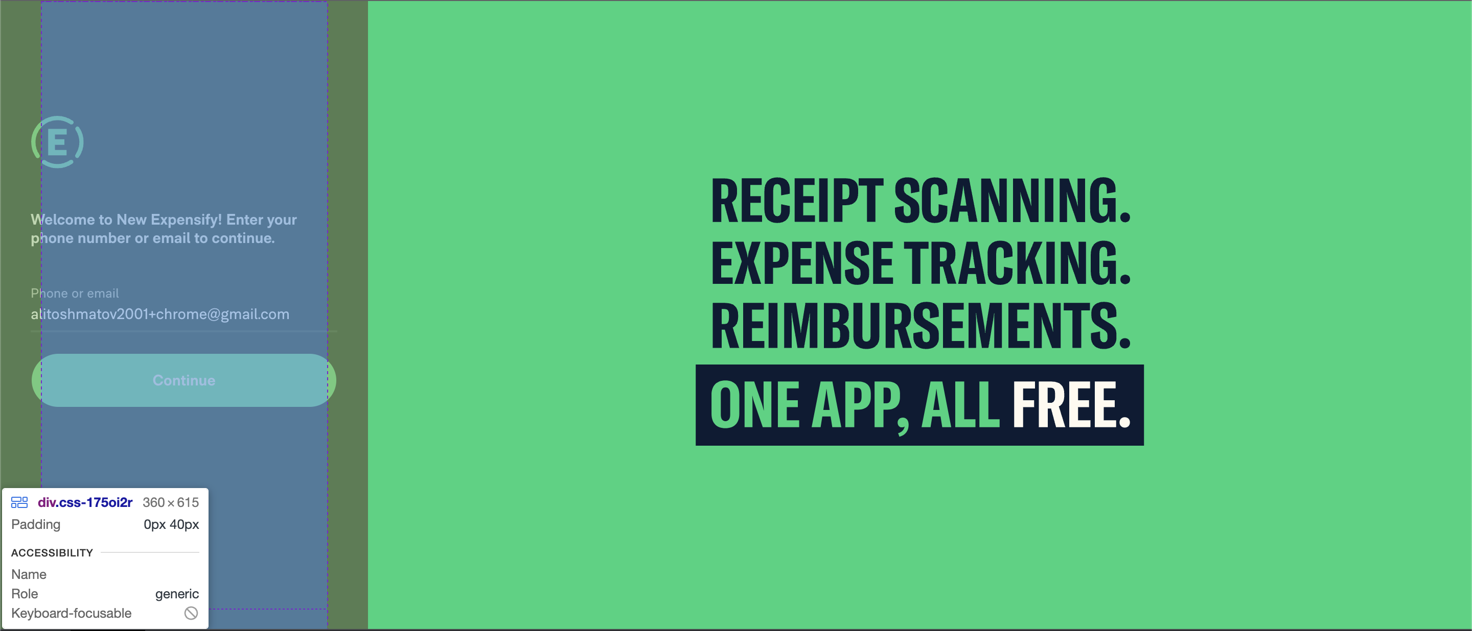
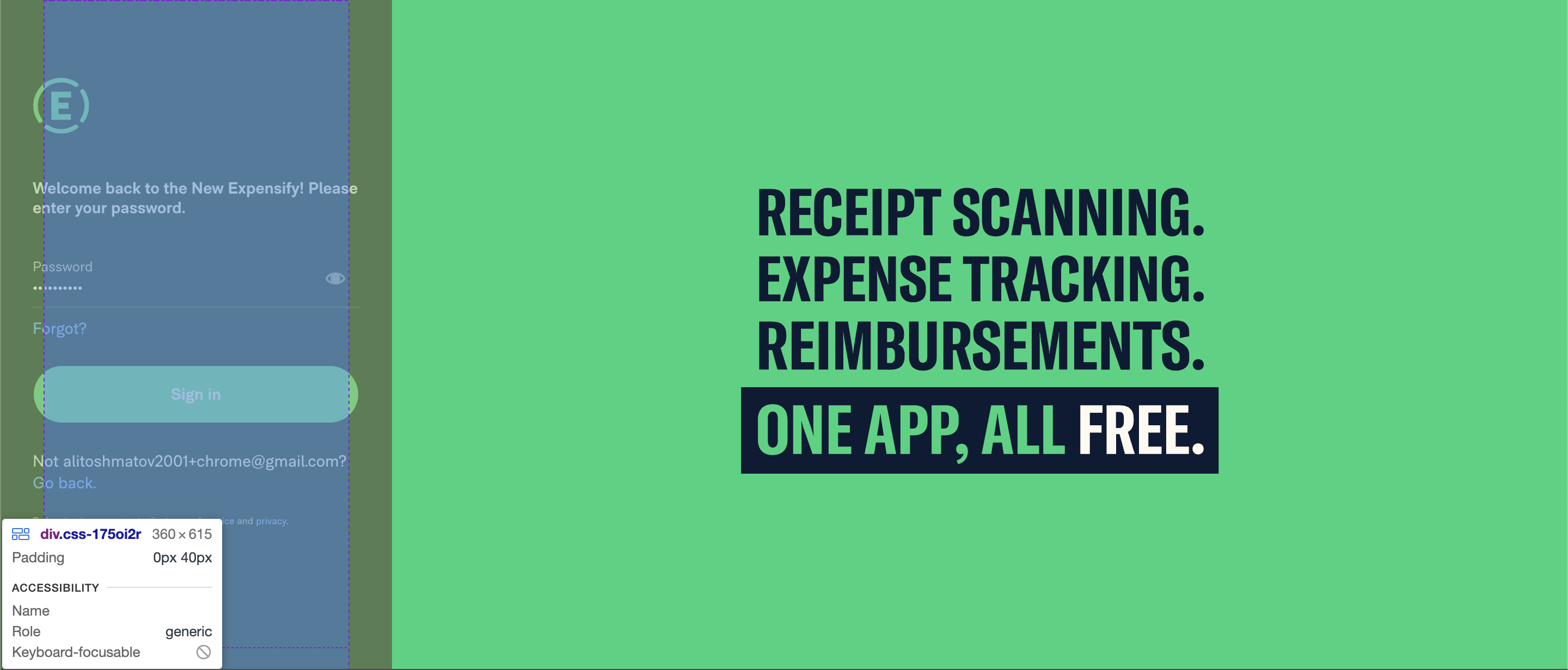
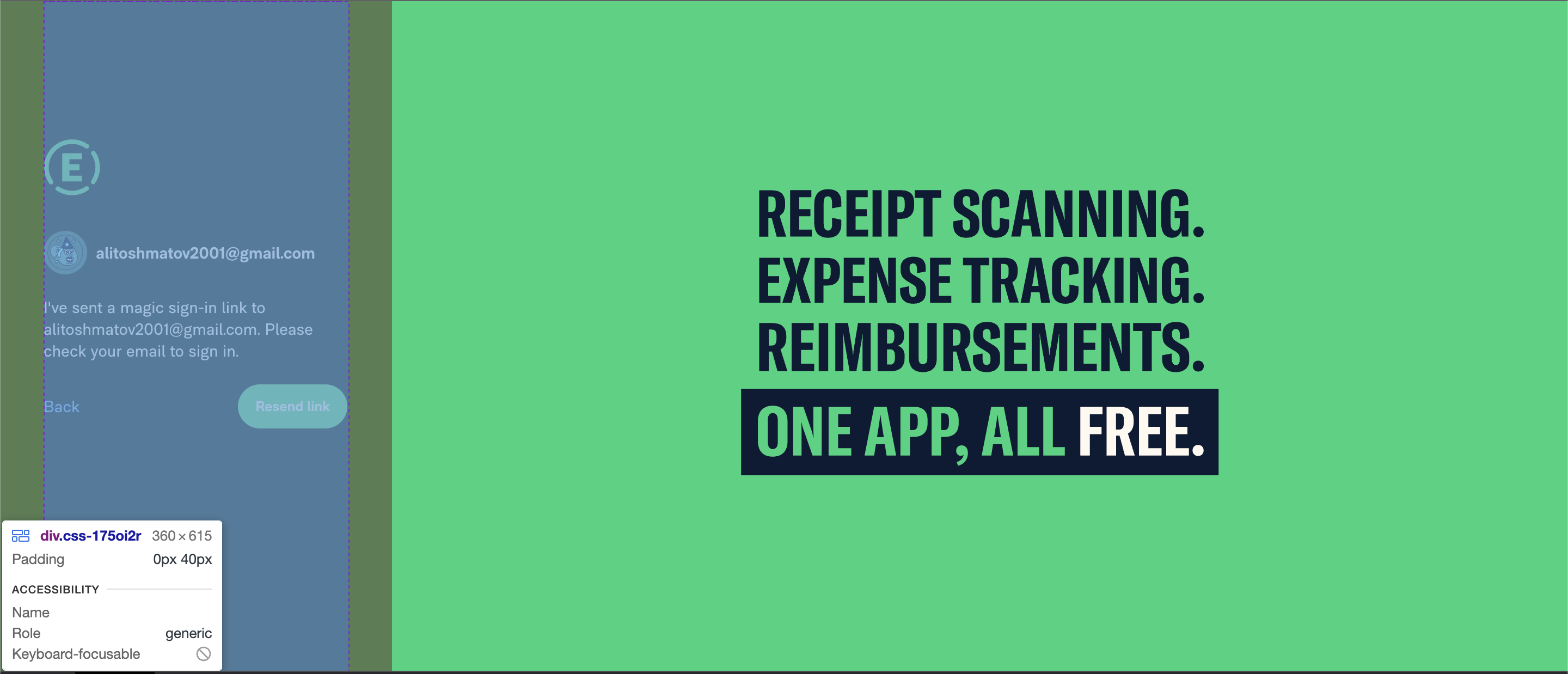
New discovery: If email is too long the content will outgrow the parent and overflow, but it also has
max-width: 300pxand will stop at 300px looking like, acting the same as other two pages(signin, password)cead22 commentedon Apr 18, 2023
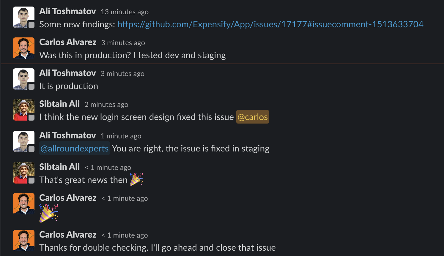
We discussed further on slack and it turns out we can't reproduce on dev or staging anymore, even though we can repro in production -- so we're closing this issue
michaelhaxhiu commentedon Apr 19, 2023
The assigned C+ (Rajat) reviewed quite a few proposals here before we came to learn this was fixed elsewhere. For that reason let's offer a partial compensation of 25% - discussed in the #c+ internal slack channel here.
michaelhaxhiu commentedon Apr 19, 2023
@parasharrajat lmk when you accept https://www.upwork.com/jobs/~014b51493b1fd78e8a
michaelhaxhiu commentedon Apr 20, 2023
paid, closing.