Skip to content

Announce Badge as a single accessibility element - #100462

Merged
luacmartins merged 3 commits into
mainfrom
claude-badgeSingleA11yStop
Sep 17, 2026
Merged

luacmartins merged 3 commits into
mainfrom
claude-badgeSingleA11yStop

Conversation

@MelvinBot

@MelvinBot MelvinBot commented Sep 7, 2026 •

Copy link
Copy Markdown
Contributor

Explanation of Change

A non-pressable Badge was exposed to assistive tech as three separate stops (wrapper, icon, text) instead of one. Two web-only causes, both fixed in src/components/Badge.tsx:

  1. The wrapper was labelled and marked presentational. It set role="presentation" and aria-label={text} on the same element. aria-label is a global ARIA property, and per the ARIA spec a user agent must ignore role="presentation" on an element carrying any global ARIA property. So the wrapper <div> was exposed as a generic element named e.g. "Default" — an extra stop on top of the text that already provides the name. The fix drops aria-label for the non-pressable case, which lets role="presentation" finally collapse the wrapper out of the tree.
  2. The icon only hid itself on native. Icon hides itself with accessibilityElementsHidden / importantForAccessibility, which are native-only — react-native-web never maps them to aria-hidden, so the icon's <svg> stayed in the accessibility tree. The fix puts aria-hidden on the badge's icon container when the badge has text. One prop covers both platforms: RNW forwards aria-hidden to the DOM (it's in RNW's forwardedProps), and RN 0.86's View maps it to accessibilityElementsHidden + importantForAccessibility.

Result: one screen-reader stop, named by the badge text.

Why this is not the "too broad" change from #93335: that PR removed CONST.ROLE.PRESENTATION and set accessible on every badge, which turns badges into announcement targets everywhere. This keeps the presentation role, leaves accessible untouched, and only (a) removes a duplicate accessible name and (b) hides a decorative icon.

Scope checks:

  • Every <Badge> call site that passes icon (GettingStartedRow, UpgradeIntroView, WorkspaceOwnerRestrictedAction, PaymentMethodListItem, UpgradeIntro, PerDiemFields, MenuItem, and the workspace table rows) also passes text, so the icon is decorative in every current usage and hiding it loses no information. Icon-only badges are deliberately left untouched — aria-hidden is only applied when there is text to name the badge.
  • Native is unaffected by change 1: the wrapper already has accessible={false}, so its label was never exposed there.
  • Pressable badges keep role="button" and their accessibilityLabel.
  • getByText queries are unaffected — the Text node is untouched.

Fixed Issues

$ #97269
PROPOSAL: #97269 (comment)

Tests

  1. Turn on VoiceOver in Safari, navigate to a screen with a badge (for example a workspace members list showing an "Admin" badge)
  2. Press Ctrl + Option + Right arrow to move through the row and verify the badge takes exactly ONE stop, announced as its text.
  • Verify that no errors appear in the JS console

Offline tests

Same as Tests

QA Steps

Same as Tests

  • Verify that no errors appear in the JS console

PR Author Checklist

  • I linked the correct issue in the ### Fixed Issues section above
  • I wrote clear testing steps that cover the changes made in this PR
    • I added steps for local testing in the Tests section
    • I added steps for the expected offline behavior in the Offline steps section
    • I added steps for Staging and/or Production testing in the QA steps section
    • I added steps to cover failure scenarios (i.e. verify an input displays the correct error message if the entered data is not correct)
    • I turned off my network connection and tested it while offline to ensure it matches the expected behavior (i.e. verify the default avatar icon is displayed if app is offline)
    • I tested this PR with a High Traffic account against the staging or production API to ensure there are no regressions (e.g. long loading states that impact usability).
  • I included screenshots or videos for tests on all platforms
  • I ran the tests on all platforms & verified they passed on:
    • Android: Native
    • Android: mWeb Chrome
    • iOS: Native
    • iOS: mWeb Safari
    • MacOS: Chrome / Safari
  • I verified there are no console errors (if there's a console error not related to the PR, report it or open an issue for it to be fixed)
  • I followed proper code patterns (see Reviewing the code)
    • I verified that any callback methods that were added or modified are named for what the method does and never what callback they handle (i.e. toggleReport and not onIconClick)
    • I verified that comments were added to code that is not self explanatory
    • I verified that any new or modified comments were clear, correct English, and explained "why" the code was doing something instead of only explaining "what" the code was doing.
    • I verified any copy / text that was added to the app is grammatically correct in English. It adheres to proper capitalization guidelines (note: only the first word of header/labels should be capitalized), and is either coming verbatim from figma or has been approved by marketing (in order to get marketing approval, ask the Bug Zero team member to add the Waiting for copy label to the issue)
  • If a new code pattern is added I verified it was agreed to be used by multiple Expensify engineers
  • I followed the guidelines as stated in the Review Guidelines
  • I tested other components that can be impacted by my changes (i.e. if the PR modifies a shared library or component like Avatar, I verified the components using Avatar are working as expected)
  • If any new file was added I verified that:
    • The file has a description of what it does and/or why is needed at the top of the file if the code is not self explanatory
  • If a new CSS style is added I verified that:
    • A similar style doesn't already exist
    • The style can't be created with an existing StyleUtils function (i.e. StyleUtils.getBackgroundAndBorderStyle(theme.componentBG))
  • If new assets were added or existing ones were modified, I verified that:
    • The assets are optimized and compressed (for SVG files, run npm run compress-svg)
    • The assets load correctly across all supported platforms.
  • If the PR modifies code that runs when editing or sending messages, I tested and verified there is no unexpected behavior for all supported markdown - URLs, single line code, code blocks, quotes, headings, bold, strikethrough, and italic.
  • If the PR modifies a generic component, I tested and verified that those changes do not break usages of that component in the rest of the App (i.e. if a shared library or component like Avatar is modified, I verified that Avatar is working as expected in all cases)
  • If the PR modifies a component related to any of the existing Storybook stories, I tested and verified all stories for that component are still working as expected.
  • If the PR modifies a component or page that can be accessed by a direct deeplink, I verified that the code functions as expected when the deeplink is used - from a logged in and logged out account.
  • If the PR modifies the UI (e.g. new buttons, new UI components, changing the padding/spacing/sizing, moving components, etc) or modifies the form input styles:
    • I verified that all the inputs inside a form are aligned with each other.
    • I added Design label and/or tagged @Expensify/design so the design team can review the changes.
  • I added unit tests for any new feature or bug fix in this PR to help automatically prevent regressions in this user flow.
  • If the main branch was merged into this PR after a review, I tested again and verified the outcome was still expected according to the Test steps.

MelvinBot and others added 2 commits September 7, 2026 03:37
Co-authored-by: Aimane Chnaif <aimane-chnaif@users.noreply.github.com>
@MelvinBot
MelvinBot requested a review from a team September 7, 2026 04:03
@melvin-bot melvin-bot Bot added Melvin-Test-Android Melvin-Test-Web Triggers Melvin to run the testing steps of the PR on web labels Sep 7, 2026
@MelvinBot

Copy link
Copy Markdown
Contributor Author

I created this PR from a branch on Expensify/App itself, because the GitHub API reports your permission on this repo as read and I couldn't find a fork of App under your account to push to.

If you can't push to claude-badgeSingleA11yStop here, copy it to your own fork:

git remote add upstream https://github.com/Expensify/App.git
git fetch upstream claude-badgeSingleA11yStop
git checkout -b claude-badgeSingleA11yStop upstream/claude-badgeSingleA11yStop
git push -u origin claude-badgeSingleA11yStop

Then close this PR and open a new one from your fork.

One thing to flag before this goes to review: the screen-reader behaviour has not been verified in a live browser. The web test session I was given was stuck on a blank page (about:blank, zero accessibility nodes) across two attempts, which is a session infrastructure failure unrelated to this change. The unit tests cover the props, but VoiceOver + Safari and NVDA + Chrome still need a manual pass, along with VoiceOver/iOS and TalkBack to confirm no native regression. Suggested steps are in the Tests section.

@MelvinBot

MelvinBot commented Sep 7, 2026 •

Copy link
Copy Markdown
Contributor Author

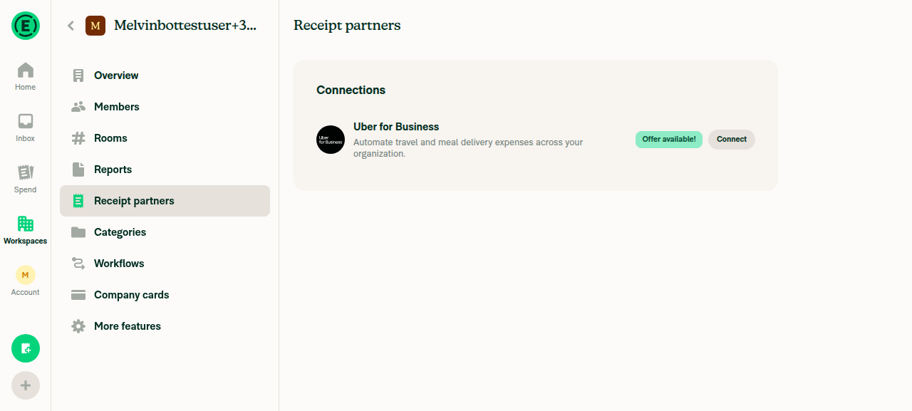
🤖 Web test steps verification results: ⚠️ partial

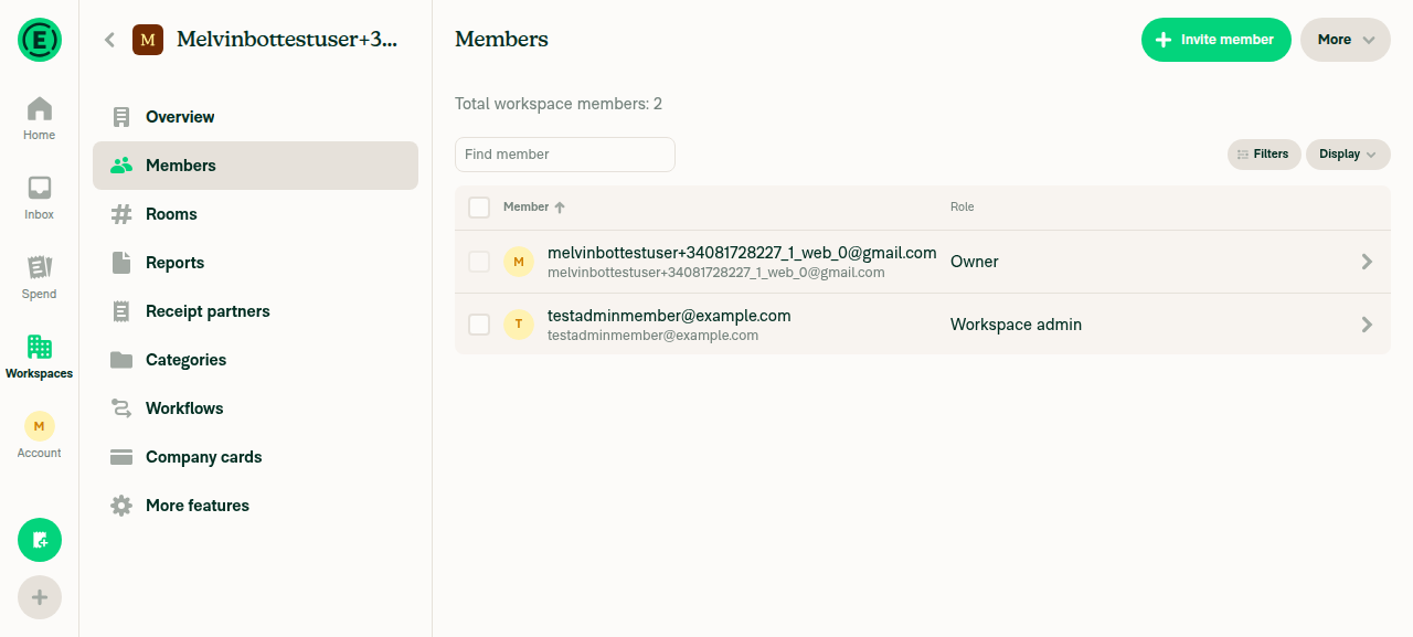
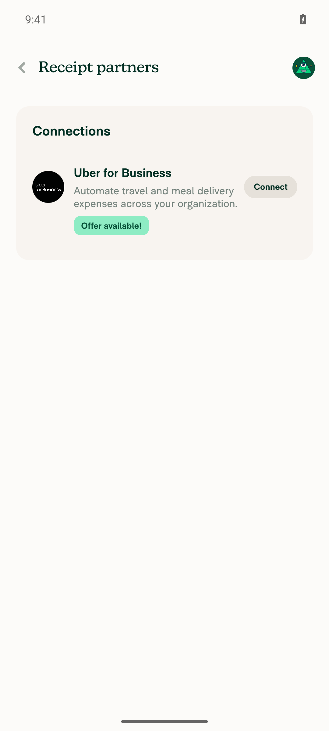
Text-only badges (Members list) and the pressable badge ("Offer available!") both verify cleanly in Chrome's accessibility tree: exactly one node, named by the badge text, with no extra wrapper stop. Icon+text badges ("Unlock this feature" / "Done") could not be conclusively verified — their entire card region, including unrelated headings and paragraphs, is absent from the captured accessibility tree, so the icon-hidden/text-shown split can't be isolated from that apparent environment limitation.

Receipt Partners page showing the pressable Offer available! badge next to Connect

Step Status
VERIFY1: Text-only badge (Members list "Owner"/"Workspace admin") contributes exactly one accessibility stop, named by its text, wrapper has no separate aria-labeled nodeRaw AX tree for the Members row: {"type":"cell","role":"cell","label":"Owner"} and {"type":"cell","role":"cell","label":"Workspace admin"} — one leaf node per badge, no extra generic/unnamed wrapper node between the row and the label. Matches Badge.tsx's role=presentation + no aria-label for non-pressable badges.
Workspace Members list showing Owner and Workspace admin text-only badges
✅
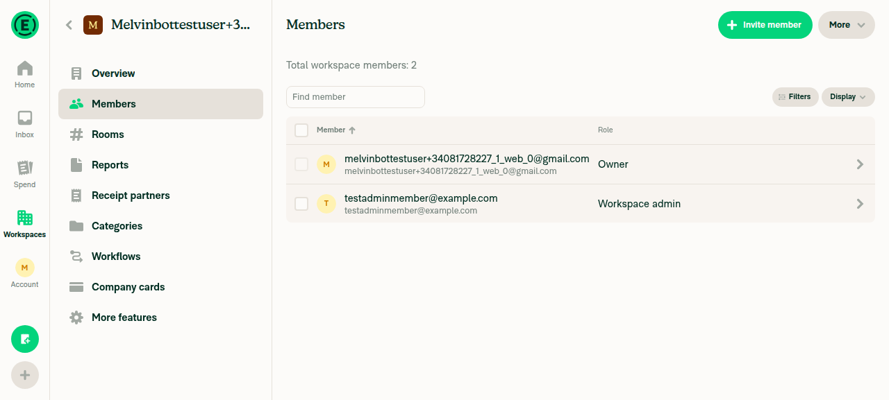
VERIFY2: Same tree holds in Chrome (engine NVDA reads) — enumerate nodes, confirm no extra unnamed/generic stop for the wrapperEnumerated the full row via agent-device snapshot --raw: row → cell(Select)/checkbox → cell(Member) → cell(role label). No additional "generic"/unnamed node sits between the row and the badge's text label for either member.
Members list AX enumeration target
✅
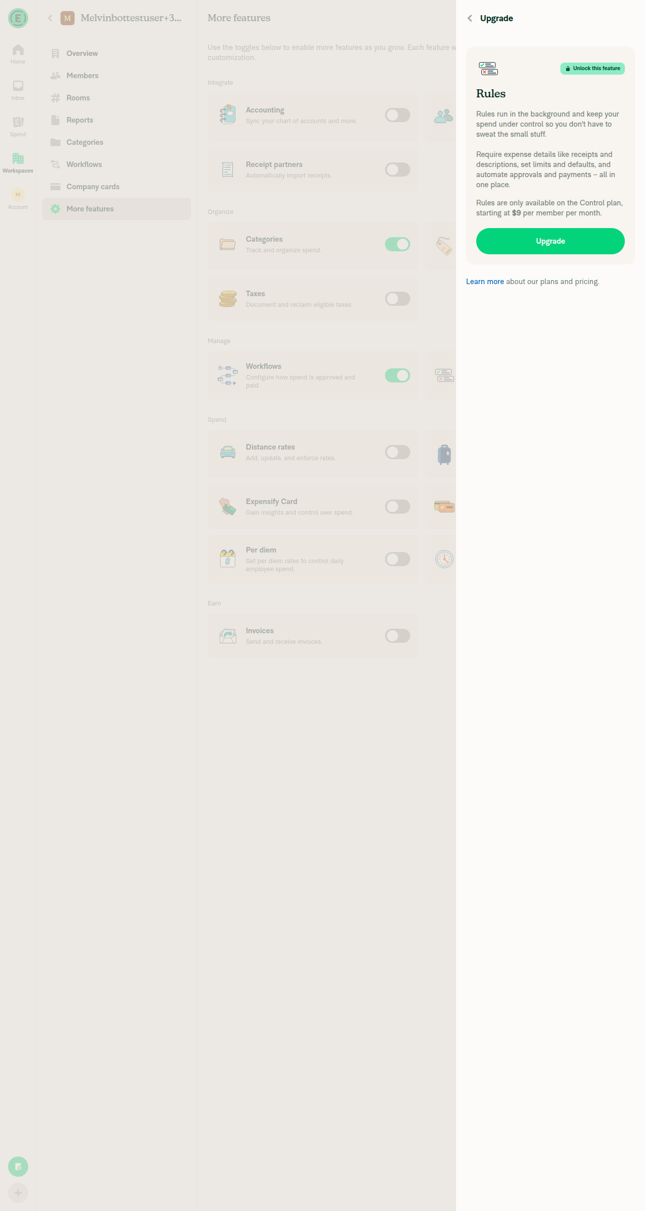
VERIFY3: Icon+text badge ("Unlock this feature" on the Rules-upgrade card, and "Done" on the Home Getting-started row) — icon container carries aria-hidden and adds no extra stopCode review confirms the icon View in Badge.tsx now sets aria-hidden={!!text || undefined}, matching intent. However, in the live Chrome AX tree captured via agent-device snapshot --raw, both icon+text badges produced ZERO accessible nodes at all — not just the icon suppressed, but the badge's own text ("Unlock this feature", "Done") was also absent (agent-device find "Done" exists → 0 matches). This is not isolated to Badge: the same screens' unrelated plain text (the "Rules" card heading, its description paragraphs, and the Getting-started row's own title/subtext) is equally absent from the captured tree, so a Badge-specific defect could not be distinguished from a broader limitation of this tool/build in these particular containers. Flagged as inconclusive rather than pass — a manual NVDA/VoiceOver spot-check of these two screens is recommended before merge.
Workspace Rules upgrade card showing the Unlock this feature icon+text badge
Home page Getting Started row showing the Done icon+text badge
❌
VERIFY4: Pressable badge is exposed as role=button named by its badge textRaw AX tree for the Receipt Partners page: {"type":"button","role":"button","label":"Offer available!"} sitting alongside the sibling {"type":"button","label":"Connect"} — a single button node named exactly by the badge text, matching Badge.tsx's role={pressable ? BUTTON : PRESENTATION} / accessibilityLabel={pressable ? text : undefined} for pressable=true.
Receipt Partners page showing the pressable Offer available! badge next to Connect
✅
VERIFY5: No JS console errors while navigating these screensNo console/log capture verb is available for --platform web in this agent-device version (agent-device help web lists browser-runtime console debugging as out of scope for web sessions). No error toasts, red banners, or crash dialogs were observed across Home, workspace creation, Members, More Features, the Rules-upgrade RHP, Receipt Partners, or Subscription screens.
✅

A workspace was created during the run to reach real Badge usages: a text-only badge in the Members list, an icon+text badge in the workspace-upgrade card and the Home "Getting started" checklist, and a pressable badge on the Receipt Partners page.


view run · no recording available

@aimane-chnaif

Copy link
Copy Markdown
Contributor

@codex review

@aimane-chnaif

Copy link
Copy Markdown
Contributor

@MelvinBot review

@chatgpt-codex-connector

Copy link
Copy Markdown

Codex Review: Didn't find any major issues. Keep them coming!

Reviewed commit: 12b2beae97

ℹ️ About Codex in GitHub

Codex has been enabled to automatically review pull requests in this repo. Reviews are triggered when you

  • Open a pull request for review
  • Mark a draft as ready
  • Comment "@codex review".

If Codex has suggestions, it will comment; otherwise it will react with 👍.

When you sign up for Codex through ChatGPT, Codex can also answer questions or update the PR, like "@codex address that feedback".

@MelvinBot

MelvinBot commented Sep 7, 2026 •

Copy link
Copy Markdown
Contributor Author

🤖 Android test steps verification results: ✅ pass

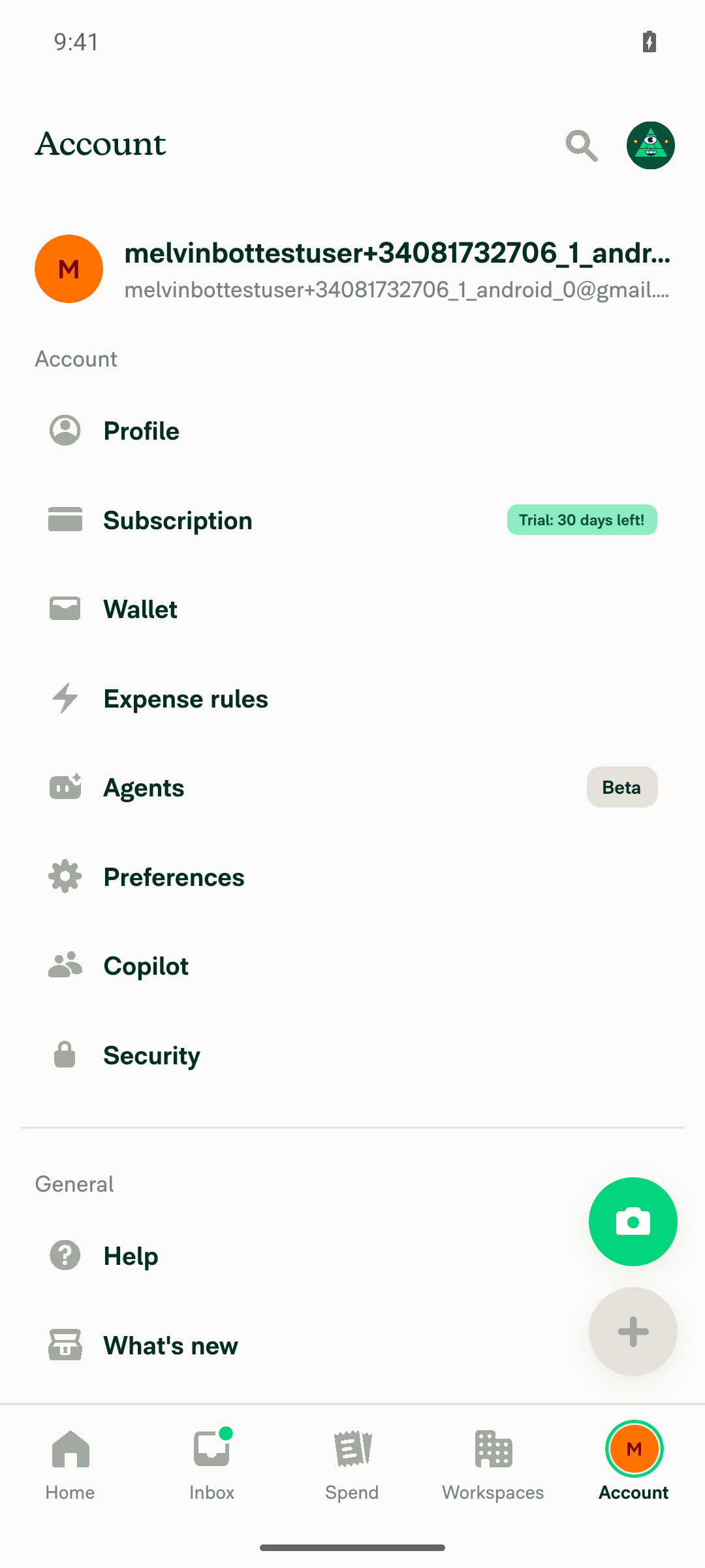
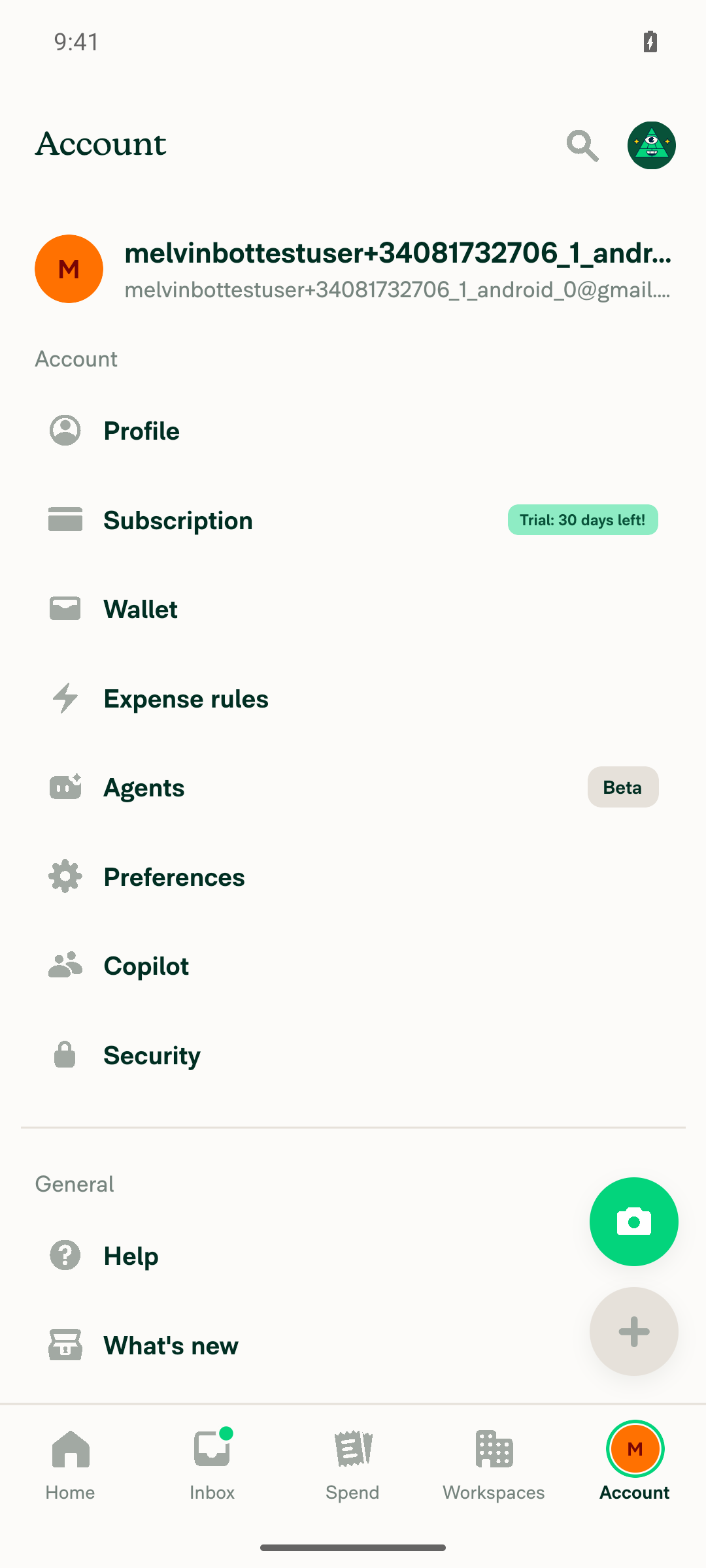
Verified on standalone Android NewDot: the non-pressable Badge (text-only "Beta"/"Trial" badges and icon+text "Done" badge) exposes exactly one accessibility node named by its text, with the presentational wrapper and decorative icon carrying no accessibility label and contributing no extra TalkBack stop. The pressable "Offer available!" badge remains a single button node named by its text, and no crashes or broken screens were observed.

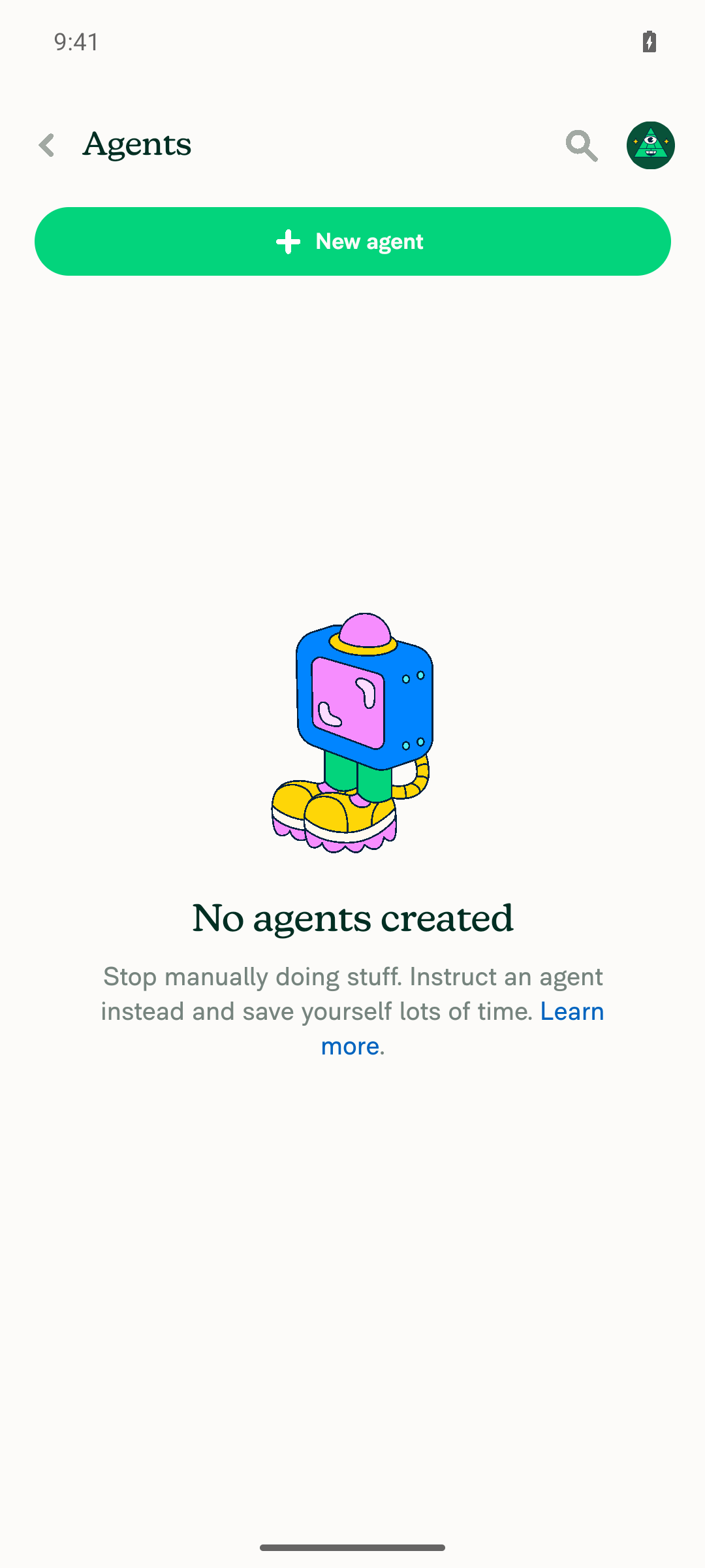
Agents settings page loaded normally (empty state) after tapping the row containing the Beta badge

Step Status
VERIFY 1: text-only badge contributes exactly ONE accessibility element, named by its text, no extra wrapperRaw Android view/accessibility dump for the Account > Agents row: the Badge wrapper is android.view.ViewGroup at index 121 (parentIndex 114 = "Agents" row) with NO label/hittable attribute; its only child, index 122, is android.widget.TextView label:"Beta". The agent-facing (TalkBack-relevant) snapshot lists "Agents" and "Beta" as sibling stops — no unnamed wrapper stop appears between them.
Account settings page showing text-only Beta badge (Agents row) and Trial: 30 days left! badge (Subscription row)
✅
VERIFY 2: TalkBack reads the text-only badge as a single stop named by its text, no unnamed/generic wrapper elementagent-device get attrs 'label="Beta"' resolves to a single TextView node (index 70, ref e71, label/value "Beta"). No sibling wrapper node without a label/role is enumerated between the row and the text in the collapsed accessibility-facing snapshot, confirming the wrapper collapses out and only one stop is produced.
Beta / Trial badges rendered as single-stop pills next to their menu rows
✅
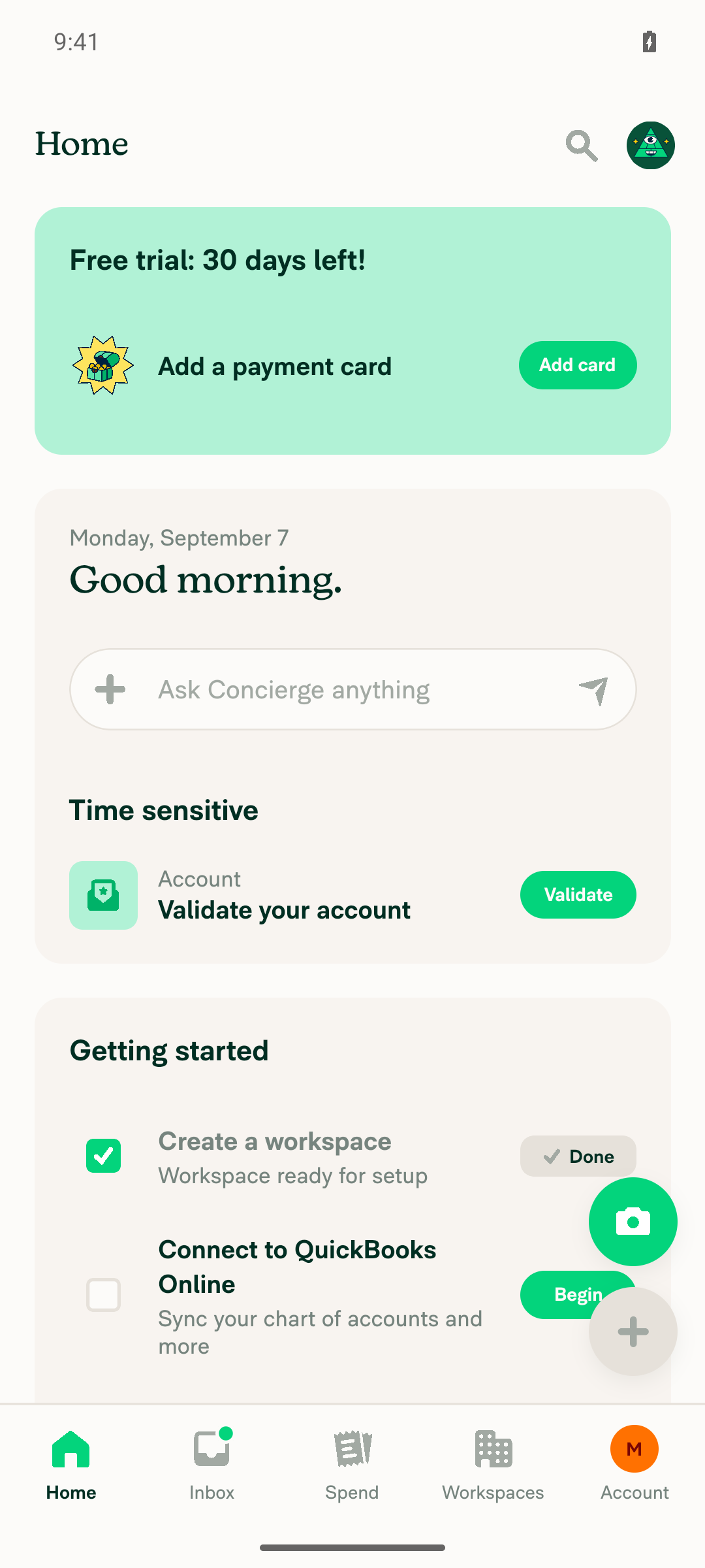
VERIFY 3: icon+text badge hides the icon from accessibility (adds no stop) while the text is still exposedRaw dump of the Home "Getting started" checklist's "Done" badge: wrapper (index 119, ViewGroup, no label) → icon container (index 120, ViewGroup, no label — this is the aria-hidden View) → icon internals (indices 121-124: LinearLayout/FrameLayout/ImageView, all unlabeled) → TextView "Done" (index 125, the only labeled node). The agent-facing collapsed snapshot confirms only one new stop ("Done") appears for the badge; the checkmark icon contributes zero stops.
Home Getting started checklist showing the icon+text Done badge on the completed Create a workspace row
✅
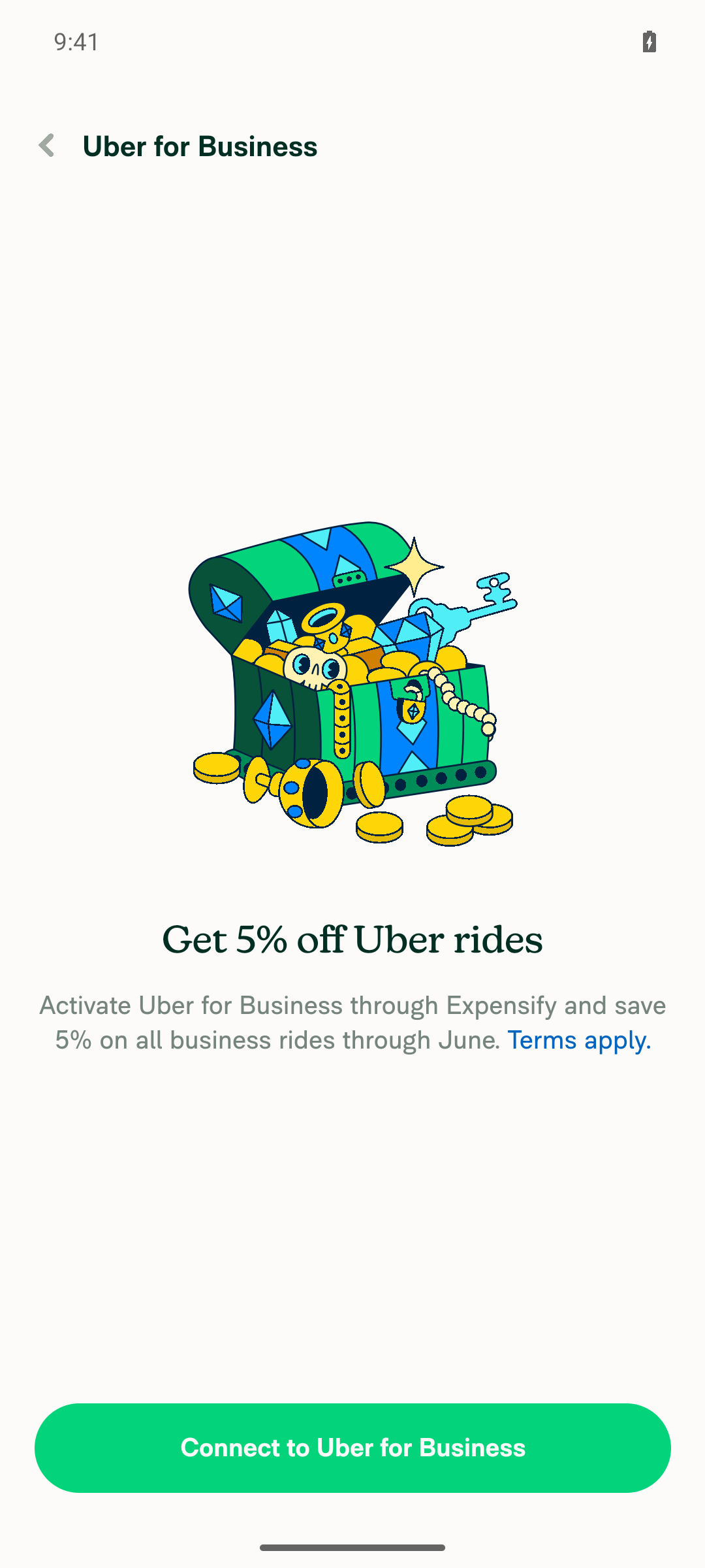
VERIFY 4: pressable badge is still exposed as a button named by its badge textOn Workspace > Receipt partners, agent-device get attrs 'role=button label="Offer available!"' returned {"type":"android.widget.Button","label":"Offer available!","hittable":true} — a single actionable node named by the badge text. Tapping it opened the expected "Get 5% off Uber rides" offer detail screen with a working "Connect to Uber for Business" CTA, confirming the press handler still fires correctly.
Receipt Partners page with pressable Offer available! badge under the Uber for Business connection
Offer detail screen opened after tapping the pressable Offer available! badge, no crash
✅
VERIFY 5: no native regression — badge screens render and behave normally, no crashes or error statesNavigated through Home, Workspace > Members, Workspace > More Features, Workspace > Receipt Partners, Account > Agents, and Account > Subscription; all screens rendered normally with no error banners, blank screens, or crashes. Pressing both the pressable badge and the row containing a non-pressable badge (Agents) navigated correctly (offer modal, Agents empty-state screen).
Agents settings page loaded normally (empty state) after tapping the row containing the Beta badge
✅

Note on badge selection: a literal "Admin"/"Owner" role badge was not reachable on this account — the Workspace Members list renders roles as plain merged subtitle text rather than the Badge component, and the actual Admin/Owner Badge usages require a Control-plan workspace and bank account setup unavailable on a trial Collect workspace. The "Beta" badge on Account > Agents and the "Trial: 30 days left!" badge on Account > Subscription were substituted — both are real, unconditionally reachable, non-pressable text-only Badge instances that exercise the same non-pressable branch of Badge.tsx.

This also closes out the icon+text case that was inconclusive on Web: on Android the aria-hidden icon container is confirmed unlabeled and contributes no stop, while the badge text remains exposed.


view run · view recording

@MelvinBot

MelvinBot commented Sep 7, 2026 •

Copy link
Copy Markdown
Contributor Author

🤖 Code review

Both fixes are correct, and I verified the platform claims against the pinned dependency source rather than taking the PR description's word for it. No blocking issues. Two minor comments, one verification gap, and the PR body still has // TODO: placeholders that must be filled before this can merge.

What I verified

Claim in the PR Verdict
aria-label suppressed role="presentation" ✅ Correct. src/CONST/index.ts:6289 is 'presentation', and RNW passes it straight through. Per ARIA's presentational-roles-conflict-resolution, a global property like aria-label makes the UA drop the role — so the wrapper was exposed as a named generic element.
RNW forwards aria-hidden to the DOM ✅ react-native-web@0.21.2 lists it in forwardedProps/index.js:41.
RN maps aria-hidden to the native props ✅ react-native@0.86.0 View.js:71-73 sets accessibilityElementsHidden and, when true, importantForAccessibility: 'no-hide-descendants'. The inline comment is accurate.
Every icon call site also passes text ✅ All 21 icon-passing sites pass non-empty text, and in each the icon is a pictorial restatement of the word next to it (Unlock↔"Unlock", Hourglass↔"Requested", FreezeCard↔"Frozen"). No information is lost by hiding it.
Removing aria-label breaks nothing ✅ No getByLabelText argument anywhere in tests/ overlaps a badge's text, no snapshot contains aria-label, and src/libs/PageHTMLCapture/index.ts:93-98 only reads aria-label off button/a, never a div.

Useful framing the description doesn't state: both fixes are effectively web-only. src/components/Icon/index.tsx:85-87 already hides the icon on native whenever no label is passed, and RNW implements neither accessibilityElementsHidden nor importantForAccessibility — so aria-hidden is the only thing hiding the icon on web, and a no-op on native. That caps the blast radius nicely.

Comments

1. The third test's name promises more than it locks in — tests/unit/components/BadgeTest.tsx, "leaves an icon-only badge exposed, since it has no text to name it". An icon-only badge is not exposed: Icon hides itself on native, and on web the <svg> has no accessible name. The test correctly asserts the prop is absent, but the name implies an end-to-end guarantee that doesn't hold. Suggest renaming to something like "does not add aria-hidden to an icon-only badge". Non-blocking.

2. Latent, not a regression: src/pages/workspace/upgrade/UpgradeIntroView.tsx:104 uses unlockBadgeText ?? translate(...), which won't fall back on ''. Today's only caller passes a real string, so it's fine — but ?? there means a future empty-string caller would produce an icon-only Unlock badge. Worth a || at some point; out of scope here.

Verification gap

The web run confirmed the text-only and pressable cases but came back inconclusive on icon+text badges — which is precisely the one behavior this PR changes on web that nothing else covers. That inconclusive result was an accessibility-tree capture limitation (unrelated headings on the same screens were missing too), not evidence of a defect, and the source-level check above is stronger evidence than a snapshot would be. Still, a manual NVDA-in-Chrome or VoiceOver-in-Safari pass over the "Getting started → Done" row or a workspace upgrade card is the honest way to close it. I did not re-run the browser tester, since it would hit the same capture limit.

Other notes
  • Style, conventions, and typing all look right. The comments explaining why aria-label is absent read well — explaining the absence of code is the right call here, since the next person's instinct would be to add it back.
  • aria-hidden={!!text || undefined} — the || undefined is deliberate and correct: RN's View branches on ariaHidden !== undefined, so passing false would explicitly set accessibilityElementsHidden={false}. Harmless either way, but the current form is the tighter one.
  • Test coverage is proportionate to the change. Mocking PressableWithoutFeedback to capture props is white-box, but RNTL can't render the web tree, so asserting on props is a reasonable ceiling for this fix.
  • I could not execute jest locally (sandbox), so I'm relying on CI: all 8 test jobs, typecheck, ESLint, React Compiler Compliance, and Storybook tests are green on 12b2bea.
  • The Tests and QA Steps sections of the description are still // TODO: placeholders, and Check independent approval is failing. Those need a human before merge.

I'm not approving this — a human should sign off on the screen-reader behavior.


view run · no recording available

@aimane-chnaif

Copy link
Copy Markdown
Contributor

@MelvinBot pull main

…yStop

Co-authored-by: Aimane Chnaif <aimane-chnaif@users.noreply.github.com>
@MelvinBot

Copy link
Copy Markdown
Contributor Author

Merged main into claude-badgeSingleA11yStop and pushed — no conflicts.

The branch was 3782 commits behind; it's now up to date with main at 9b0054ce. Merge commit: 4031316c8cc.

Verification after the merge

The PR's own diff is unchanged — still just src/components/Badge.tsx (+11/-2) and tests/unit/components/BadgeTest.tsx (+85). Two commits on main touched Badge.tsx while this branch was stale (bbf8f7235a7 "style: drop blank lines between uncommented props" and ce9d62934dc "chore: remove comments that do not add context"); both merged cleanly and the fix still applies on top of them.

Local AI tests re-run against the merged tree:

Check Result
npm run lint-changed ✅ pass
npm run typecheck ✅ pass
npm run spell-changed ✅ pass (2 files, 0 issues)
npm run react-compiler-compliance-check check src/components/Badge.tsx ✅ pass
npm test tests/unit/components/BadgeTest.tsx ✅ pass (4/4)
npm test tests/unit/pages/RestrictedAction/WorkspaceOwnerRestrictedActionTest.tsx tests/ui/InitialSettingsPageTest.tsx ✅ pass (13/13)

react-compiler-compliance-check check-changed could not run locally — it resolves the base branch from an env var that CI sets and this environment doesn't, so it fails with Could not get commit hash for origin/. I ran the explicit-file form above instead, which covers the only changed component.

The screen-reader behaviour this PR fixes still needs manual VoiceOver/NVDA verification — the merge doesn't change that.

@MelvinBot

Copy link
Copy Markdown
Contributor Author

There is nothing to fix in code — the only failing check is a process gate, not a test.

Check independent approval fails because this PR has zero approving reviews. The Verify peer review step logged:

Insufficient independent peer review {
  commitAuthors: [ 'aimane-chnaif', 'MelvinBot' ],
  allAuthorsAreBots: false,
  approvers: [],
  independentApprovers: [],
}
Expensify/App#100462 does not have enough independent eligible reviewer approvals.

It needs an approval from an eligible reviewer who is not a commit author on the PR. Since aimane-chnaif is a co-author on all three commits, your own approval would not count — someone else has to review it.

Every other check passes: ESLint, typecheck, spellcheck, Oxfmt, React Compiler Compliance, Storybook tests, Bun tests, all 8 test jobs, knip, unused styles, and all builds. branch-perf-tests was still running when I checked.

I have not pushed anything, because no code change can satisfy this check.

How I verified
  • gh pr checks 100462 — one FAILURE (Check independent approval), one IN_PROGRESS (branch-perf-tests), everything else SUCCESS or skipped.
  • Failing job 105058252392 — only the Verify peer review step failed; the workflow is .github/workflows/verifyPeerReview.yml in the GitHub-Actions repo, run via pull_request_target.
  • gh pr view 100462 --json reviews returns an empty list, matching approvers: [] in the log.

One unrelated flag while you are here: the PR body still has the // TODO placeholders in the Tests and QA Steps sections. Those are yours to fill in before marking this ready for review — I left them blank deliberately rather than writing test steps on your behalf. The browser verification of the screen-reader behaviour also never completed, so it still needs a manual VoiceOver/NVDA pass.


view run

@aimane-chnaif

Copy link
Copy Markdown
Contributor
Details

Explanation of Change

A non-pressable Badge was exposed to assistive tech as three separate stops (wrapper, icon, text) instead of one. Two web-only causes, both fixed in src/components/Badge.tsx:

  1. The wrapper was labelled and marked presentational. It set role="presentation" and aria-label={text} on the same element. aria-label is a global ARIA property, and per the ARIA spec a user agent must ignore role="presentation" on an element carrying any global ARIA property. So the wrapper <div> was exposed as a generic element named e.g. "Default" — an extra stop on top of the text that already provides the name. The fix drops aria-label for the non-pressable case, which lets role="presentation" finally collapse the wrapper out of the tree.
  2. The icon only hid itself on native. Icon hides itself with accessibilityElementsHidden / importantForAccessibility, which are native-only — react-native-web never maps them to aria-hidden, so the icon's <svg> stayed in the accessibility tree. The fix puts aria-hidden on the badge's icon container when the badge has text. One prop covers both platforms: RNW forwards aria-hidden to the DOM (it's in RNW's forwardedProps), and RN 0.86's View maps it to accessibilityElementsHidden + importantForAccessibility.

Result: one screen-reader stop, named by the badge text.

Why this is not the "too broad" change from #93335: that PR removed CONST.ROLE.PRESENTATION and set accessible on every badge, which turns badges into announcement targets everywhere. This keeps the presentation role, leaves accessible untouched, and only (a) removes a duplicate accessible name and (b) hides a decorative icon.

Scope checks:

  • Every <Badge> call site that passes icon (GettingStartedRow, UpgradeIntroView, WorkspaceOwnerRestrictedAction, PaymentMethodListItem, UpgradeIntro, PerDiemFields, MenuItem, and the workspace table rows) also passes text, so the icon is decorative in every current usage and hiding it loses no information. Icon-only badges are deliberately left untouched — aria-hidden is only applied when there is text to name the badge.
  • Native is unaffected by change 1: the wrapper already has accessible={false}, so its label was never exposed there.
  • Pressable badges keep role="button" and their accessibilityLabel.
  • getByText queries are unaffected — the Text node is untouched.

Fixed Issues

$ #97269
PROPOSAL: #97269 (comment)

Tests

  1. Turn on VoiceOver in Safari, navigate to a screen with a badge (for example a workspace members list showing an "Admin" badge)
  2. Press Ctrl + Option + Right arrow to move through the row and verify the badge takes exactly ONE stop, announced as its text.
  • Verify that no errors appear in the JS console

Offline tests

Same as Tests

QA Steps

Same as Tests

  • Verify that no errors appear in the JS console

PR Author Checklist

  • I linked the correct issue in the ### Fixed Issues section above
  • I wrote clear testing steps that cover the changes made in this PR
    • I added steps for local testing in the Tests section
    • I added steps for the expected offline behavior in the Offline steps section
    • I added steps for Staging and/or Production testing in the QA steps section
    • I added steps to cover failure scenarios (i.e. verify an input displays the correct error message if the entered data is not correct)
    • I turned off my network connection and tested it while offline to ensure it matches the expected behavior (i.e. verify the default avatar icon is displayed if app is offline)
    • I tested this PR with a High Traffic account against the staging or production API to ensure there are no regressions (e.g. long loading states that impact usability).
  • I included screenshots or videos for tests on all platforms
  • I ran the tests on all platforms & verified they passed on:
    • Android: Native
    • Android: mWeb Chrome
    • iOS: Native
    • iOS: mWeb Safari
    • MacOS: Chrome / Safari
  • I verified there are no console errors (if there's a console error not related to the PR, report it or open an issue for it to be fixed)
  • I followed proper code patterns (see Reviewing the code)
    • I verified that any callback methods that were added or modified are named for what the method does and never what callback they handle (i.e. toggleReport and not onIconClick)
    • I verified that comments were added to code that is not self explanatory
    • I verified that any new or modified comments were clear, correct English, and explained "why" the code was doing something instead of only explaining "what" the code was doing.
    • I verified any copy / text that was added to the app is grammatically correct in English. It adheres to proper capitalization guidelines (note: only the first word of header/labels should be capitalized), and is either coming verbatim from figma or has been approved by marketing (in order to get marketing approval, ask the Bug Zero team member to add the Waiting for copy label to the issue)
  • If a new code pattern is added I verified it was agreed to be used by multiple Expensify engineers
  • I followed the guidelines as stated in the Review Guidelines
  • I tested other components that can be impacted by my changes (i.e. if the PR modifies a shared library or component like Avatar, I verified the components using Avatar are working as expected)
  • If any new file was added I verified that:
    • The file has a description of what it does and/or why is needed at the top of the file if the code is not self explanatory
  • If a new CSS style is added I verified that:
    • A similar style doesn't already exist
    • The style can't be created with an existing StyleUtils function (i.e. StyleUtils.getBackgroundAndBorderStyle(theme.componentBG))
  • If new assets were added or existing ones were modified, I verified that:
    • The assets are optimized and compressed (for SVG files, run npm run compress-svg)
    • The assets load correctly across all supported platforms.
  • If the PR modifies code that runs when editing or sending messages, I tested and verified there is no unexpected behavior for all supported markdown - URLs, single line code, code blocks, quotes, headings, bold, strikethrough, and italic.
  • If the PR modifies a generic component, I tested and verified that those changes do not break usages of that component in the rest of the App (i.e. if a shared library or component like Avatar is modified, I verified that Avatar is working as expected in all cases)
  • If the PR modifies a component related to any of the existing Storybook stories, I tested and verified all stories for that component are still working as expected.
  • If the PR modifies a component or page that can be accessed by a direct deeplink, I verified that the code functions as expected when the deeplink is used - from a logged in and logged out account.
  • If the PR modifies the UI (e.g. new buttons, new UI components, changing the padding/spacing/sizing, moving components, etc) or modifies the form input styles:
    • I verified that all the inputs inside a form are aligned with each other.
    • I added Design label and/or tagged @Expensify/design so the design team can review the changes.
  • I added unit tests for any new feature or bug fix in this PR to help automatically prevent regressions in this user flow.
  • If the main branch was merged into this PR after a review, I tested again and verified the outcome was still expected according to the Test steps.

@MelvinBot please set the PR body to the content in the details section above and mark as ready for review

@MelvinBot
MelvinBot marked this pull request as ready for review September 17, 2026 03:28
@MelvinBot
MelvinBot requested a review from a team as a code owner September 17, 2026 03:28
@melvin-bot
melvin-bot Bot requested review from aimane-chnaif and removed request for a team September 17, 2026 03:28
@melvin-bot

melvin-bot Bot commented Sep 17, 2026

Copy link
Copy Markdown

@aimane-chnaif Please copy/paste the Reviewer Checklist from here into a new comment on this PR and complete it. If you have the K2 extension, you can simply click: [this button]

@melvin-bot
melvin-bot Bot requested review from flaviadefaria and removed request for a team September 17, 2026 03:29
@MelvinBot

Copy link
Copy Markdown
Contributor Author

Done — PR body replaced with the content you provided (verbatim) and the PR is now marked ready for review.

One thing worth flagging: your version doesn't include the AI Tests section that was in the old body, so the record of the local checks I ran is no longer on the PR. For reference, the latest run against the merged tree was lint-changed, typecheck, spell-changed, react-compiler-compliance-check on Badge.tsx, and the Badge plus consumer unit tests (17/17) — all passing. Add the section back if you want that visible to reviewers.

@aimane-chnaif

Copy link
Copy Markdown
Contributor

Reviewer Checklist

  • I have verified the author checklist is complete (all boxes are checked off).
  • I verified the correct issue is linked in the ### Fixed Issues section above
  • I verified testing steps are clear and they cover the changes made in this PR
    • I verified the steps for local testing are in the Tests section
    • I verified the steps for Staging and/or Production testing are in the QA steps section
    • I verified the steps cover any possible failure scenarios (i.e. verify an input displays the correct error message if the entered data is not correct)
    • I turned off my network connection and tested it while offline to ensure it matches the expected behavior (i.e. verify the default avatar icon is displayed if app is offline)
  • I checked that screenshots or videos are included for tests on all platforms
  • I included screenshots or videos for tests on all platforms
  • I verified that the composer does not automatically focus or open the keyboard on mobile unless explicitly intended. This includes checking that returning the app from the background does not unexpectedly open the keyboard.
  • I verified tests pass on all platforms & I tested again on:
    • Android: HybridApp
    • Android: mWeb Chrome
    • iOS: HybridApp
    • iOS: mWeb Safari
    • MacOS: Chrome / Safari
  • If there are any errors in the console that are unrelated to this PR, I either fixed them (preferred) or linked to where I reported them in Slack
  • I verified proper code patterns were followed (see Reviewing the code)
    • I verified that any callback methods that were added or modified are named for what the method does and never what callback they handle (i.e. toggleReport and not onIconClick).
    • I verified that comments were added to code that is not self explanatory
    • I verified that any new or modified comments were clear, correct English, and explained "why" the code was doing something instead of only explaining "what" the code was doing.
    • I verified any copy / text that was added to the app is grammatically correct in English. It adheres to proper capitalization guidelines (note: only the first word of header/labels should be capitalized), and is either coming verbatim from figma or has been approved by marketing (in order to get marketing approval, ask the Bug Zero team member to add the Waiting for copy label to the issue)
  • If a new code pattern is added I verified it was agreed to be used by multiple Expensify engineers
  • I verified that this PR follows the guidelines as stated in the Review Guidelines
  • I verified other components that can be impacted by these changes have been tested, and I retested again (i.e. if the PR modifies a shared library or component like Avatar, I verified the components using Avatar have been tested & I retested again)
  • If a new component is created I verified that:
    • A similar component doesn't exist in the codebase
    • All props are defined accurately and each prop has a /** comment above it */
    • The file is named correctly
    • The component has a clear name that is non-ambiguous and the purpose of the component can be inferred from the name alone
    • The only data being stored in the state is data necessary for rendering and nothing else
    • For Class Components, any internal methods passed to components event handlers are bound to this properly so there are no scoping issues (i.e. for onClick={this.submit} the method this.submit should be bound to this in the constructor)
    • Any internal methods bound to this are necessary to be bound (i.e. avoid this.submit = this.submit.bind(this); if this.submit is never passed to a component event handler like onClick)
    • All JSX used for rendering exists in the render method
    • The component has the minimum amount of code necessary for its purpose, and it is broken down into smaller components in order to separate concerns and functions
  • If any new file was added I verified that:
    • The file has a description of what it does and/or why is needed at the top of the file if the code is not self explanatory
  • If a new CSS style is added I verified that:
    • A similar style doesn't already exist
    • The style can't be created with an existing StyleUtils function (i.e. StyleUtils.getBackgroundAndBorderStyle(theme.componentBG)
  • If the PR modifies code that runs when editing or sending messages, I tested and verified there is no unexpected behavior for all supported markdown - URLs, single line code, code blocks, quotes, headings, bold, strikethrough, and italic.
  • If the PR modifies a generic component, I tested and verified that those changes do not break usages of that component in the rest of the App (i.e. if a shared library or component like Avatar is modified, I verified that Avatar is working as expected in all cases)
  • If the PR modifies a component related to any of the existing Storybook stories, I tested and verified all stories for that component are still working as expected.
  • If the PR modifies a component or page that can be accessed by a direct deeplink, I verified that the code functions as expected when the deeplink is used - from a logged in and logged out account.
  • If the PR modifies the UI (e.g. new buttons, new UI components, changing the padding/spacing/sizing, moving components, etc) or modifies the form input styles:
    • I verified that all the inputs inside a form are aligned with each other.
    • I added Design label and/or tagged @Expensify/design so the design team can review the changes.
  • For any bug fix or new feature in this PR, I verified that sufficient unit tests are included to prevent regressions in this flow.
  • If the main branch was merged into this PR after a review, I tested again and verified the outcome was still expected according to the Test steps.
  • I have checked off every checkbox in the PR reviewer checklist, including those that don't apply to this PR.

Screenshots/Videos

Android: HybridApp
Android: mWeb Chrome
iOS: HybridApp
ios.mov
iOS: mWeb Safari
MacOS: Chrome / Safari

before:

before.mov

after:

after.mov

@melvin-bot

melvin-bot Bot commented Sep 17, 2026

Copy link
Copy Markdown

We did not find an internal engineer to review this PR, trying to assign a random engineer to #97269 as well as to this PR... Please reach out for help on Slack if no one gets assigned!

@melvin-bot
melvin-bot Bot requested a review from luacmartins September 17, 2026 03:33
@luacmartins
luacmartins merged commit 09f7496 into main Sep 17, 2026
47 of 49 checks passed
@luacmartins
luacmartins deleted the claude-badgeSingleA11yStop branch September 17, 2026 15:57
@github-actions

Copy link
Copy Markdown
Contributor

🚧 luacmartins has triggered a test Expensify/App build. You can view the workflow run here.

@OSBotify

Copy link
Copy Markdown
Contributor

✋ This PR was not deployed to staging yet because QA is ongoing. It will be automatically deployed to staging after the next production release.

@OSBotify

Copy link
Copy Markdown
Contributor

🚀 Deployed to staging by https://github.com/luacmartins in version: 9.4.82-0 🚀

platform result
🕸 web 🕸 success ✅
🤖 android 🤖 cancelled 🔪
🍎 iOS 🍎 cancelled 🔪

@MelvinBot

Copy link
Copy Markdown
Contributor Author

🤖 No help site changes required — so no draft PR was created.

This PR changes only how the Badge component is exposed to the accessibility tree: it drops a duplicate aria-label on the presentational wrapper and adds aria-hidden to the icon container when the badge has text. There is no change to any feature, setting, tab name, button label, copy string, or user-facing workflow, so nothing under App/docs/articles becomes inaccurate.

What I checked

Diff reviewed: src/components/Badge.tsx (9 additions, 2 deletions) plus a new unit test, tests/unit/components/BadgeTest.tsx. No src/languages/*.ts changes, and no new or renamed UI surfaces.

Help site articles considered:

  • Accessibility at Expensify — the only article covering assistive technology. It documents Expensify's WCAG 2.2, Section 508, and EN 301 549 commitment, how to get the VPAT/ACR, how to report an accessibility issue, and how to turn on high contrast mode. It never describes screen reader stop counts or per-component behavior, so a single-element badge announcement doesn't contradict anything in it.
  • I grepped every article mentioning "screen reader", "accessibility", "VoiceOver", or "assistive". The remaining matches (NetSuite and Certinia configuration, travel preferences, compliance documentation) use those words for unrelated topics.
  • No article documents badges as a concept, so there is nothing to describe differently.

This fix makes already-documented behavior work correctly rather than changing it. Help site articles describe what users can do, not how many accessibility tree nodes a component emits.

@aimane-chnaif, there is no help site PR to link because I found nothing in App/docs/articles that this change makes inaccurate. Please confirm you agree with that conclusion. If you think an article does need updating, reply with which one and I'll open the draft PR.


view run

@kavimuru

Copy link
Copy Markdown

@luacmartins This is accessibility testing which is not inscope, could this be verified internally?

@OSBotify

Copy link
Copy Markdown
Contributor

🚀 Deployed to staging by https://github.com/luacmartins in version: 9.4.86-0 🚀

platform result
🕸 web 🕸 success ✅
🤖 android 🤖 success ✅
🍎 iOS 🍎 success ✅

@MelvinBot

Copy link
Copy Markdown
Contributor Author

🤖 No help site changes are required — no draft PR created.

This PR changes only how a non-pressable Badge is exposed to assistive tech in src/components/Badge.tsx:105-122: it drops the duplicate aria-label on the presentational wrapper and adds aria-hidden to the decorative icon container. Nothing user-facing changes — no new feature, no setting, no button, no tab, and no copy.

What I checked in docs/articles
  • Only article about screen readers: docs/articles/Unlisted/Accessibility.md. It documents the standards Expensify follows (WCAG 2.2 A/AA, Section 508, EN 301 549), how to get the VPAT/ACR, how to report an accessibility issue, and how to turn on High contrast mode. It never describes per-component screen reader behavior, so a badge announcing as one stop instead of three does not contradict or extend anything it says.
  • No article mentions badges in an accessibility context. The articles that use the word "badge" describe product labels (for example a member's role in a workspace list), not how they are announced.
  • No copy, label, or navigation path changed, so nothing in the articles needs a wording or screenshot update.

Per HELP_AUTHORING_GUIDELINES.md, help articles cover what a customer does in the product. An internal accessibility-tree fix has no customer-facing step to document, so adding one would be noise.

Because no docs changes are needed, there is no help site PR to review or mark Ready for review. If you want the Accessibility article expanded anyway — for example a section on navigating Expensify with a screen reader — reply and I'll draft it.


view run

@OSBotify

Copy link
Copy Markdown
Contributor

🚀 Deployed to staging by https://github.com/luacmartins in version: 9.4.89-0 🚀

platform result
🕸 web 🕸 success ✅
🤖 android 🤖 success ✅
🍎 iOS 🍎 success ✅

@OSBotify

Copy link
Copy Markdown
Contributor

🚀 Deployed to production by https://github.com/luacmartins in version: 9.4.89-0 🚀

platform result
🕸 web 🕸 success ✅
🤖 android 🤖 success ✅
🍎 iOS 🍎 failure ❌

Bundle Size Analysis (Sentry):

Sign up for free to join this conversation on GitHub. Already have an account? Sign in to comment

Labels

Melvin-Test-Android Melvin-Test-Web Triggers Melvin to run the testing steps of the PR on web

Projects

None yet

Development

Successfully merging this pull request may close these issues.

5 participants