Repository navigation
fix: Reports - More menu on expense RHP blocks primary and secondary button. - #72530
Conversation


…button.

Signed-off-by: krishna2323 <belivethatkg@gmail.com>
Signed-off-by: krishna2323 <belivethatkg@gmail.com>

Codecov Report❌ Patch coverage is
... and 1430 files with indirect coverage changes 🚀 New features to boost your workflow:
|
Signed-off-by: krishna2323 <belivethatkg@gmail.com>
Signed-off-by: krishna2323 <belivethatkg@gmail.com>
Signed-off-by: krishna2323 <belivethatkg@gmail.com>


|
@ikevin127 Please copy/paste the Reviewer Checklist from here into a new comment on this PR and complete it. If you have the K2 extension, you can simply click: [this button] |

Reviewer Checklist
Screenshots/VideosAndroid: HybridApp
Android: mWeb Chrome
iOS: HybridApp
iOS: mWeb Safari
MacOS: Chrome / Safari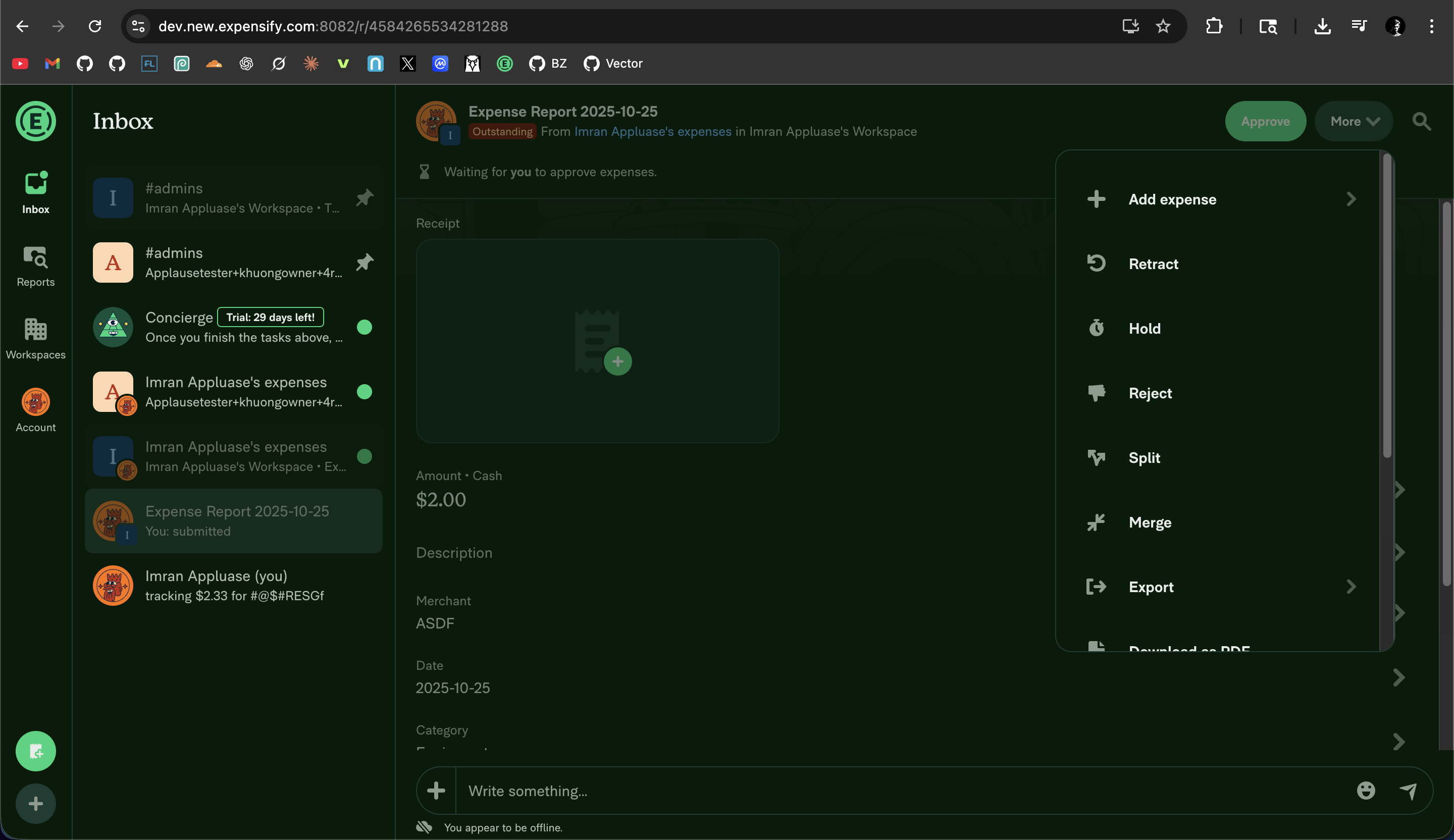
Test 2 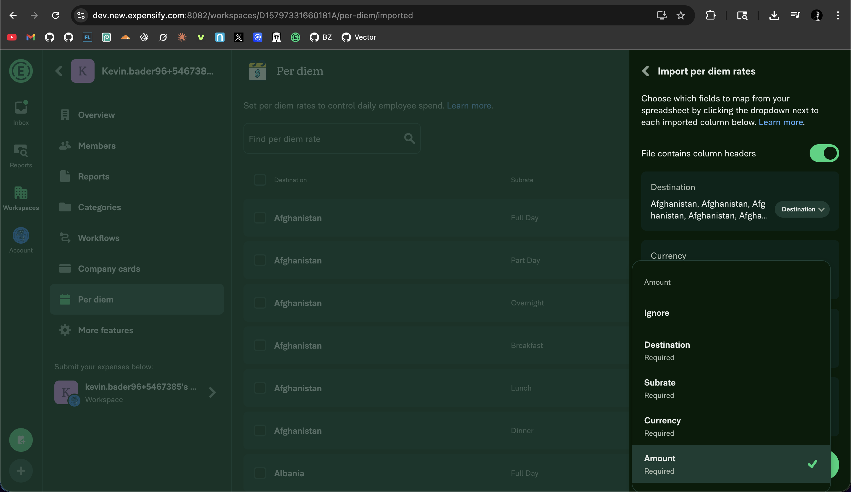
MacOS: Desktop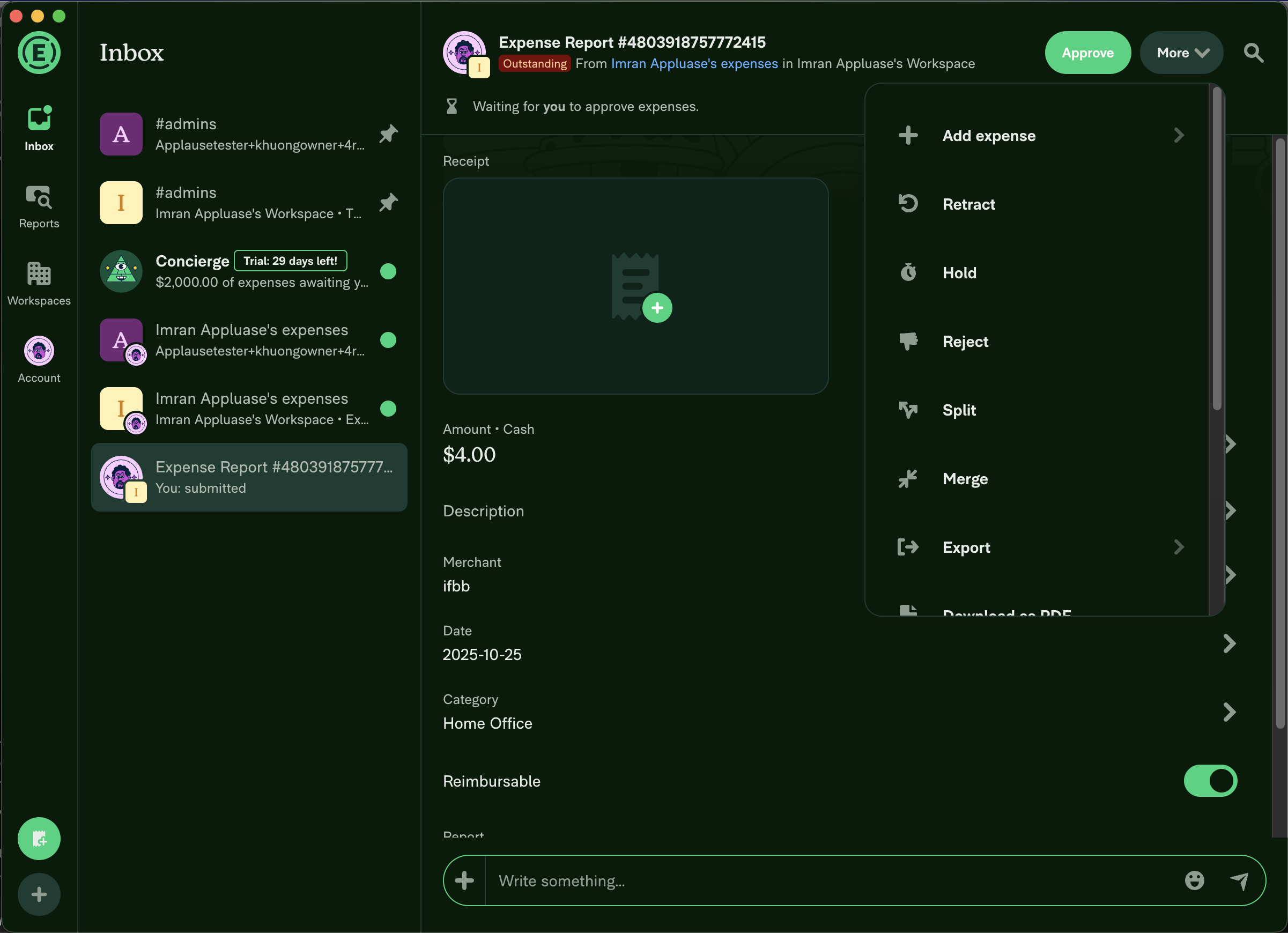
|


 dangrous
left a comment
dangrous
left a comment
There was a problem hiding this comment.
This looks good from a tech perspective. Do we need one last look from @Expensify/design?

|
Is this the latest? I still personally think we need to make these menus much shorter and have them clip one of the menu items so it's obvious the container scrolls like I suggested here. cc @dubielzyk-expensify I think what we have technically fulfills the requirements, but on desktop, when the menu is that tall, it gets confusing when there's an RHP behind it. And on both platforms, if we don't clip the one of the menu items, it's not obvious enough that there's more to see IMO. |

|
@dannymcclain the recordings in @ikevin127's checklist is wrong. Maybe he has recorded a different branch. Here's the recording from this branch: Monosnap.screencast.2025-10-25.18-06-21.mp4 |
|
ℹ️ Besides testing the 2 regression issues from the last PR, I used the recordings from the last PR (reverted) as well since I didn't expect changes to the height of the scroll list between the 2 PRs, since the first PR was reverted due to 2 regression issues and not due to scroll list height. I'm retaking the screenshots right now and will be reporting back 👍 |
|
@Expensify/design This is how things look on my side, just retook the screenshots on this PR: Android: HybridApp (took on real device OnePlus 7T - Android 15)
Android: mWeb Chrome (took on real device OnePlus 7T - Android 15)
iOS: HybridApp (took on real device iPhone 17 Pro Max - iOS 26.0.1)
iOS: mWeb Safari (took on real device iPhone 17 Pro Max - iOS 26.0.1)
MacOS: Chrome (took on MacBook Air 13" M1 2020 - Tahoe 26.0.1)
MacOS: Desktop
|

|
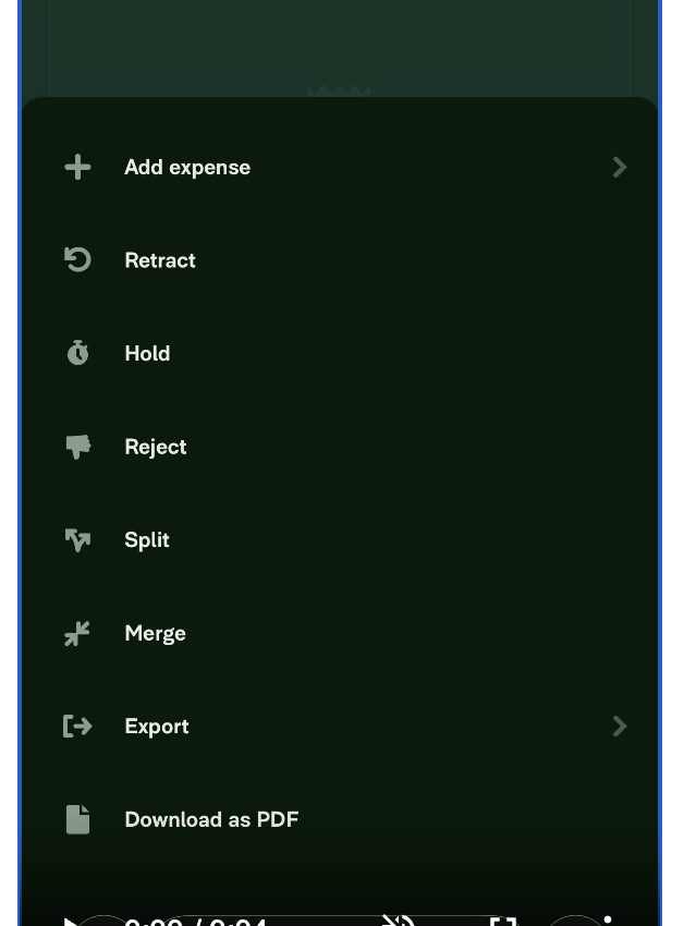
Ideally we'd want the clipping here too cause it's not super obvious that there's more content: The beautify of this on desktop is that you can clearly see something is being clipped which invites the user to scroll: 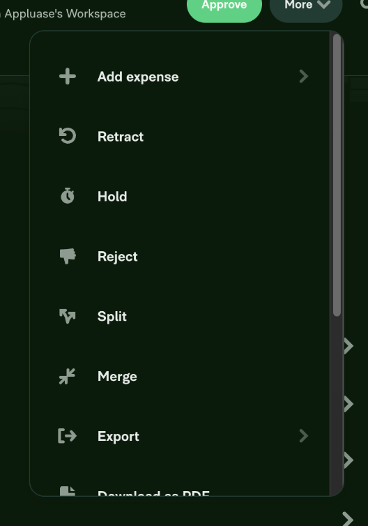
I'd love to have that on mobile too 👍 |
|
The "cut halfway through item X" is not reliable, it only works well when the maxHeight of the scroll container has the viewport height to expand fully, if the device's viewport height is smaller than that maxHeight of the scroll container -> the "cut at item X" line won't be there anymore, and depending on device's viewport height we can end up with the same issue: looking like there's nothing below since the line cuts right in between item X and item Y. Not sure whether this idea would fit in with Expensify's design, but we could implement a fade top / bottom that would show based on scroll position. This way if the list is longer than its maxHeight (has scroll overflow), by default we show fade bottom, once scrolled down -> fade top appears as well -> if scroll bottom is reached -> fade bottom goes away and we're left with fade top (since that's where we have hidden items). This is just an idea, probably design experts have a few more of these tricks up their sleeve. Edit - Example Screen.Recording.2025-10-28.at.17.25.50.mov |
|
I guess looking at the height of the mobile viewport, I'd expect the max-height to be smaller than 600-700px. On desktop it's showing 7.5 items and I guess what I'm suggesting is maybe make it 6.5 items so that we can get that max-height crop on mobile by default as well. Thoughts on that? |
|
Totally agree with Jon. Desktop is looking super nice though. |
Signed-off-by: krishna2323 <belivethatkg@gmail.com>
|
@Expensify/design If we want to show the 7th item clipped, we need to use a fixed max height instead of a dynamic max height, which currently is Monosnap.screencast.2025-10-28.14-08-10.mp4 |
I think this looks pretty dang good! I think this is more clear than how it was before. cc @dubielzyk-expensify for his thoughts as well. |

|
Agree with that. It's only really this menu that has so many options, right? Can you send a video with the (+) button on the home screen? I wanna just make sure we don't clip that one. |
Signed-off-by: krishna2323 <belivethatkg@gmail.com>
|
@Expensify/design: Monosnap.screencast.2025-10-29.19-59-47.mp4 |
|
Legend! That looks good to me. @dannymcclain for last check |
|
@ikevin127 please review the latest changes and proceed if everything tests well. Thanks! |

|
Looks good to me too! |

|
This looks great! Test failure seems unrelated so trying a rerun, will merge if we get all green |


|
✋ This PR was not deployed to staging yet because QA is ongoing. It will be automatically deployed to staging after the next production release. |

|
🚀 Deployed to staging by https://github.com/dangrous in version: 9.2.42-0 🚀
|


|
🚀 Deployed to production by https://github.com/luacmartins in version: 9.2.42-11 🚀
|


Explanation of Change
Fixed Issues
$ #70364
PROPOSAL: #70364 (comment)
Tests
Precondition:
Test 1:
Test 2:
Test 3 (Native platform):
Offline tests
QA Steps
Precondition:
Test 1:
Test 2:
Test 3 (Native platform):
PR Author Checklist
### Fixed Issuessection aboveTestssectionOffline stepssectionQA stepssectioncanBeMissingparam foruseOnyxtoggleReportand notonIconClick)src/languages/*files and using the translation methodSTYLE.md) were followedAvatar, I verified the components usingAvatarare working as expected)StyleUtils.getBackgroundAndBorderStyle(theme.componentBG))npm run compress-svg)Avataris modified, I verified thatAvataris working as expected in all cases)Designlabel and/or tagged@Expensify/designso the design team can review the changes.ScrollViewcomponent to make it scrollable when more elements are added to the page.mainbranch was merged into this PR after a review, I tested again and verified the outcome was still expected according to theTeststeps.Screenshots/Videos
Android: Native
android_native.mp4
Android: mWeb Chrome
android_chrome.mp4
iOS: Native
ios_native.mp4
iOS: mWeb Safari
ios_safari.mp4
MacOS: Chrome / Safari
web_chrome.mp4
MacOS: Desktop
desktop_app.mp4