Skip to content

Cleanup for Decompose Avatar component - #99553

Merged
roryabraham merged 4 commits into
Expensify:mainfrom
software-mansion-labs:chore/decompose-avatar-component-cleanup
Aug 31, 2026
Merged

roryabraham merged 4 commits into
Expensify:mainfrom
software-mansion-labs:chore/decompose-avatar-component-cleanup

Conversation

@jmusial

@jmusial jmusial commented Aug 26, 2026 •

Copy link
Copy Markdown
Contributor

Explanation of Change

  • Added AvatarFromIcon that renders a user or workspace avatar from an Onyx Icon entry.
  • Deleted the legacy Avatar/index.tsx facade and removed the type prop from the public avatar API
  • Migrated all facade call sites to AvatarFromIcon, collapsing repeated props spreads into a single icon prop
  • Introduced CONST.AVATAR_SHAPE (CIRCLE / ROUNDED_SQUARE). Avatar primitives now take shape instead of type.

Fixed Issues

$ #95600
PROPOSAL:

Tests

  1. Open app, log in
  2. Open a workspace chat and verify LHN row and chat header show the subscript avatar and message senders show round avatars
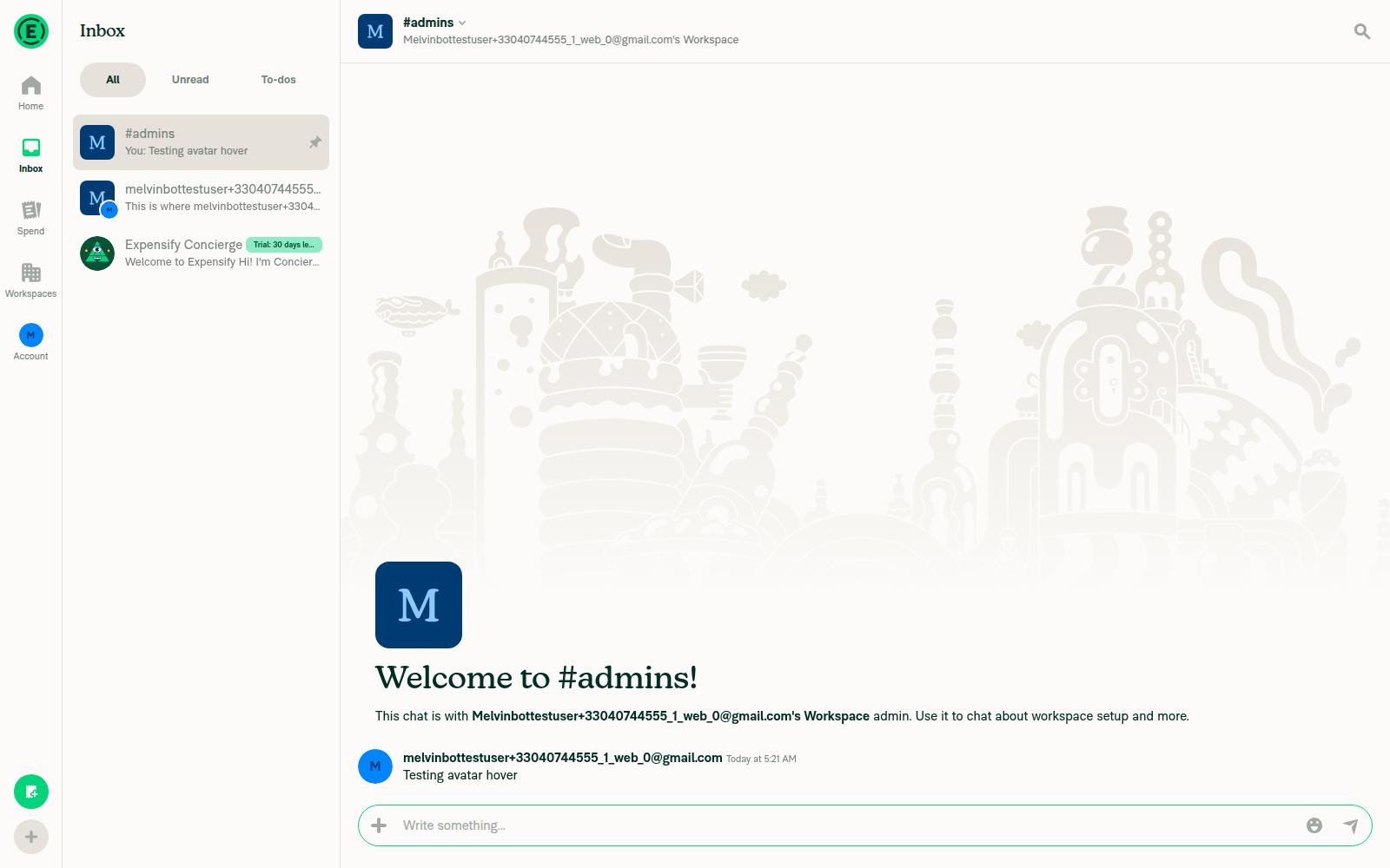
  3. Open a workspace room (e.g. #admins), tap the header to open the details page and verify the workspace avatar renders as a rounded square
  4. On Web: Hover a message sender's avatar and verify user details tooltip shows avatar, name, and email
  5. Create expense wit multiple attendees and enable attendees column on Spend -> Expenses.
  6. Navigate to Spend -> Expenses and verify that rounded stacked avatars show.

Offline tests

Same as tests

QA Steps

Same as tests

PR Author Checklist

  • I linked the correct issue in the ### Fixed Issues section above
  • I wrote clear testing steps that cover the changes made in this PR
    • I added steps for local testing in the Tests section
    • I added steps for the expected offline behavior in the Offline steps section
    • I added steps for Staging and/or Production testing in the QA steps section
    • I added steps to cover failure scenarios (i.e. verify an input displays the correct error message if the entered data is not correct)
    • I turned off my network connection and tested it while offline to ensure it matches the expected behavior (i.e. verify the default avatar icon is displayed if app is offline)
    • I tested this PR with a High Traffic account against the staging or production API to ensure there are no regressions (e.g. long loading states that impact usability).
  • I included screenshots or videos for tests on all platforms
  • I ran the tests on all platforms & verified they passed on:
    • Android: Native
    • Android: mWeb Chrome
    • iOS: Native
    • iOS: mWeb Safari
    • MacOS: Chrome / Safari
  • I verified there are no console errors (if there's a console error not related to the PR, report it or open an issue for it to be fixed)
  • I followed proper code patterns (see Reviewing the code)
    • I verified that comments were added to code that is not self explanatory
    • I verified that any new or modified comments were clear, correct English, and explained "why" the code was doing something instead of only explaining "what" the code was doing.
    • I verified any copy / text that was added to the app is grammatically correct in English. It adheres to proper capitalization guidelines (note: only the first word of header/labels should be capitalized), and is either coming verbatim from figma or has been approved by marketing (in order to get marketing approval, ask the Bug Zero team member to add the Waiting for copy label to the issue)
  • If a new code pattern is added I verified it was agreed to be used by multiple Expensify engineers
  • I followed the guidelines as stated in the Review Guidelines
  • I tested other components that can be impacted by my changes (i.e. if the PR modifies a shared library or component like Avatar, I verified the components using Avatar are working as expected)
  • If a new CSS style is added I verified that:
    • A similar style doesn't already exist
    • The style can't be created with an existing StyleUtils function (i.e. StyleUtils.getBackgroundAndBorderStyle(theme.componentBG))
  • If new assets were added or existing ones were modified, I verified that:
    • The assets are optimized and compressed (for SVG files, run npm run compress-svg)
    • The assets load correctly across all supported platforms.
  • If the PR modifies code that runs when editing or sending messages, I tested and verified there is no unexpected behavior for all supported markdown - URLs, single line code, code blocks, quotes, headings, bold, strikethrough, and italic.
  • If the PR modifies a generic component, I tested and verified that those changes do not break usages of that component in the rest of the App (i.e. if a shared library or component like Avatar is modified, I verified that Avatar is working as expected in all cases)
  • If the PR modifies a component related to any of the existing Storybook stories, I tested and verified all stories for that component are still working as expected.
  • If the PR modifies a component or page that can be accessed by a direct deeplink, I verified that the code functions as expected when the deeplink is used - from a logged in and logged out account.
  • If the PR modifies the UI (e.g. new buttons, new UI components, changing the padding/spacing/sizing, moving components, etc) or modifies the form input styles:
    • I verified that all the inputs inside a form are aligned with each other.
    • I added Design label and/or tagged @Expensify/design so the design team can review the changes.
  • I added unit tests for any new feature or bug fix in this PR to help automatically prevent regressions in this user flow.
  • If the main branch was merged into this PR after a review, I tested again and verified the outcome was still expected according to the Test steps.

Screenshots/Videos

Android: Native
Screen.Recording.2026-08-26.at.14.26.24.mov
Android: mWeb Chrome
Screen.Recording.2026-08-26.at.14.27.37.mov
iOS: Native
Screen.Recording.2026-08-26.at.14.22.57.mov
iOS: mWeb Safari
Screen.Recording.2026-08-26.at.14.24.42.mov
MacOS: Chrome / Safari
Screen.Recording.2026-08-26.at.13.53.12.mov

@codecov

codecov Bot commented Aug 26, 2026 •

Copy link
Copy Markdown

Codecov Report

✅ Changes either increased or maintained existing code coverage, great job!

Files with missing lines Coverage Δ
src/CONST/index.ts 92.66% <ø> (ø)
src/components/Avatar/AvatarFromIcon.tsx 100.00% <100.00%> (ø)
src/components/Avatar/UserAvatar.tsx 100.00% <100.00%> (ø)
src/components/Avatar/WorkspaceAvatar.tsx 100.00% <100.00%> (ø)
src/components/Avatar/layouts/DiagonalAvatars.tsx 100.00% <100.00%> (ø)
...rc/components/Avatar/layouts/HorizontalAvatars.tsx 100.00% <100.00%> (ø)
...onents/Avatar/layouts/PressableDiagonalAvatars.tsx 100.00% <100.00%> (ø)
...onents/Avatar/layouts/PressableSubscriptAvatar.tsx 100.00% <100.00%> (ø)
src/components/Avatar/layouts/SingleAvatar.tsx 100.00% <100.00%> (ø)
src/components/Avatar/layouts/SubscriptAvatar.tsx 100.00% <100.00%> (ø)
... and 21 more
... and 25 files with indirect coverage changes

@jmusial

jmusial commented Aug 26, 2026

Copy link
Copy Markdown
Contributor Author

@codex review

@chatgpt-codex-connector

Copy link
Copy Markdown

Codex Review: Didn't find any major issues. Nice work!

Reviewed commit: 1ca8ef2034

ℹ️ About Codex in GitHub

Codex has been enabled to automatically review pull requests in this repo. Reviews are triggered when you

  • Open a pull request for review
  • Mark a draft as ready
  • Comment "@codex review".

If Codex has suggestions, it will comment; otherwise it will react with 👍.

When you sign up for Codex through ChatGPT, Codex can also answer questions or update the PR, like "@codex address that feedback".

@jmusial
jmusial marked this pull request as ready for review August 26, 2026 13:21
@jmusial
jmusial requested review from a team as code owners August 26, 2026 13:21
@melvin-bot
melvin-bot Bot requested review from aimane-chnaif and removed request for a team August 26, 2026 13:21
@melvin-bot

melvin-bot Bot commented Aug 26, 2026

Copy link
Copy Markdown

@aimane-chnaif Please copy/paste the Reviewer Checklist from here into a new comment on this PR and complete it. If you have the K2 extension, you can simply click: [this button]

@melvin-bot
melvin-bot Bot requested review from heyjennahay and removed request for a team August 26, 2026 13:21
Comment thread src/styles/utils/index.ts Resolved
@aimane-chnaif

aimane-chnaif commented Aug 26, 2026 •

Copy link
Copy Markdown
Contributor

Reviewer Checklist

  • I have verified the author checklist is complete (all boxes are checked off).
  • I verified the correct issue is linked in the ### Fixed Issues section above
  • I verified testing steps are clear and they cover the changes made in this PR
    • I verified the steps for local testing are in the Tests section
    • I verified the steps for Staging and/or Production testing are in the QA steps section
    • I verified the steps cover any possible failure scenarios (i.e. verify an input displays the correct error message if the entered data is not correct)
    • I turned off my network connection and tested it while offline to ensure it matches the expected behavior (i.e. verify the default avatar icon is displayed if app is offline)
  • I checked that screenshots or videos are included for tests on all platforms
  • I included screenshots or videos for tests on all platforms
  • I verified that the composer does not automatically focus or open the keyboard on mobile unless explicitly intended. This includes checking that returning the app from the background does not unexpectedly open the keyboard.
  • I verified tests pass on all platforms & I tested again on:
    • Android: HybridApp
    • Android: mWeb Chrome
    • iOS: HybridApp
    • iOS: mWeb Safari
    • MacOS: Chrome / Safari
  • If there are any errors in the console that are unrelated to this PR, I either fixed them (preferred) or linked to where I reported them in Slack
  • I verified proper code patterns were followed (see Reviewing the code)
    • I verified that any callback methods that were added or modified are named for what the method does and never what callback they handle (i.e. toggleReport and not onIconClick).
    • I verified that comments were added to code that is not self explanatory
    • I verified that any new or modified comments were clear, correct English, and explained "why" the code was doing something instead of only explaining "what" the code was doing.
    • I verified any copy / text that was added to the app is grammatically correct in English. It adheres to proper capitalization guidelines (note: only the first word of header/labels should be capitalized), and is either coming verbatim from figma or has been approved by marketing (in order to get marketing approval, ask the Bug Zero team member to add the Waiting for copy label to the issue)
  • If a new code pattern is added I verified it was agreed to be used by multiple Expensify engineers
  • I verified that this PR follows the guidelines as stated in the Review Guidelines
  • I verified other components that can be impacted by these changes have been tested, and I retested again (i.e. if the PR modifies a shared library or component like Avatar, I verified the components using Avatar have been tested & I retested again)
  • If a new component is created I verified that:
    • A similar component doesn't exist in the codebase
    • All props are defined accurately and each prop has a /** comment above it */
    • The file is named correctly
    • The component has a clear name that is non-ambiguous and the purpose of the component can be inferred from the name alone
    • The only data being stored in the state is data necessary for rendering and nothing else
    • For Class Components, any internal methods passed to components event handlers are bound to this properly so there are no scoping issues (i.e. for onClick={this.submit} the method this.submit should be bound to this in the constructor)
    • Any internal methods bound to this are necessary to be bound (i.e. avoid this.submit = this.submit.bind(this); if this.submit is never passed to a component event handler like onClick)
    • All JSX used for rendering exists in the render method
    • The component has the minimum amount of code necessary for its purpose, and it is broken down into smaller components in order to separate concerns and functions
  • If any new file was added I verified that:
    • The file has a description of what it does and/or why is needed at the top of the file if the code is not self explanatory
  • If a new CSS style is added I verified that:
    • A similar style doesn't already exist
    • The style can't be created with an existing StyleUtils function (i.e. StyleUtils.getBackgroundAndBorderStyle(theme.componentBG)
  • If the PR modifies code that runs when editing or sending messages, I tested and verified there is no unexpected behavior for all supported markdown - URLs, single line code, code blocks, quotes, headings, bold, strikethrough, and italic.
  • If the PR modifies a generic component, I tested and verified that those changes do not break usages of that component in the rest of the App (i.e. if a shared library or component like Avatar is modified, I verified that Avatar is working as expected in all cases)
  • If the PR modifies a component related to any of the existing Storybook stories, I tested and verified all stories for that component are still working as expected.
  • If the PR modifies a component or page that can be accessed by a direct deeplink, I verified that the code functions as expected when the deeplink is used - from a logged in and logged out account.
  • If the PR modifies the UI (e.g. new buttons, new UI components, changing the padding/spacing/sizing, moving components, etc) or modifies the form input styles:
    • I verified that all the inputs inside a form are aligned with each other.
    • I added Design label and/or tagged @Expensify/design so the design team can review the changes.
  • For any bug fix or new feature in this PR, I verified that sufficient unit tests are included to prevent regressions in this flow.
  • If the main branch was merged into this PR after a review, I tested again and verified the outcome was still expected according to the Test steps.
  • I have checked off every checkbox in the PR reviewer checklist, including those that don't apply to this PR.

Screenshots/Videos

Android: HybridApp
Android: mWeb Chrome
iOS: HybridApp
ios.mov
iOS: mWeb Safari
MacOS: Chrome / Safari
web.mov

Comment thread src/styles/utils/index.ts Resolved
@melvin-bot
melvin-bot Bot requested a review from roryabraham August 27, 2026 04:53
@MelvinBot

Copy link
Copy Markdown
Contributor

Review

Overall: Clean, faithful refactor — replacing the type-based Avatar facade with AvatarFromIcon + an explicit shape prop preserves the existing rendering behavior. I verified the shape logic and ran the web test steps; avatars render correctly. One minor behavioral nit below worth a look.

✅ Verified equivalence

  • getAvatarBorderStyle now inlines the radius instead of delegating to getAvatarBorderRadius, but the output is identical: ROUNDED_SQUARE → avatarBorderSizes[size], everything else → variables.buttonBorderRadius — matching the old workspace-vs-default branch exactly. Migrated call sites that previously passed '' or ICON_TYPE_AVATAR now pass AVATAR_SHAPE.CIRCLE, which lands on the same buttonBorderRadius. No visual change.
  • AvatarFromIcon's workspace/user fork on icon.type === ICON_TYPE_WORKSPACE mirrors the old facade, and getAccountIDFromAvatarID(undefined) falls back to DEFAULT_NUMBER_ID, so dropping the explicit avatarID={... ?? DEFAULT_NUMBER_ID} at call sites is safe.

🔸 Minor: lost source fallback in BaseUserDetailsTooltip

In BaseUserDetailsTooltip/index.tsx the old code merged source={icon?.source ?? userAvatar}, so an icon with a falsy source still fell back to the resolved userAvatar. The new icon branch passes icon.source straight through (only id and name get the ?? user… fallback). If an icon is ever present with an empty source, it will now resolve the default avatar from accountID rather than using userAvatar. Likely harmless in practice (icons normally carry a source), but if you want byte-for-byte parity, spread source: icon.source || userAvatar too.

🧪 Web test results

Step Status Observation
Workspace chat: LHN row + header show subscript avatar; senders show round avatars ✅ pass LHN & header show a rounded-square main avatar with a circular subscript badge; Concierge sender avatar is a full circle
Workspace room (#admins) header → details page shows workspace avatar as rounded square ✅ pass Details page renders a large rounded-square workspace avatar
Hover sender avatar → user details tooltip shows avatar, name, email ⚠️ unverified Hover could not be simulated in the headless session (automation limitation, not shape-related) — please spot-check in a real browser

Attendee stacked-avatar steps (5–6) weren't run because the headless composer wouldn't accept typed input to create the expense; worth a manual pass.

Screenshots

Workspace chat LHN and header showing subscript avatar overlay

Zoomed LHN row: rounded-square workspace avatar with circular subscript badge
Zoomed LHN row

Concierge chat showing round avatar for message sender
Concierge chat round sender avatar

Zoomed crop confirming circular message-sender avatar
Zoomed circular sender avatar

#admins report details page showing rounded-square workspace avatar
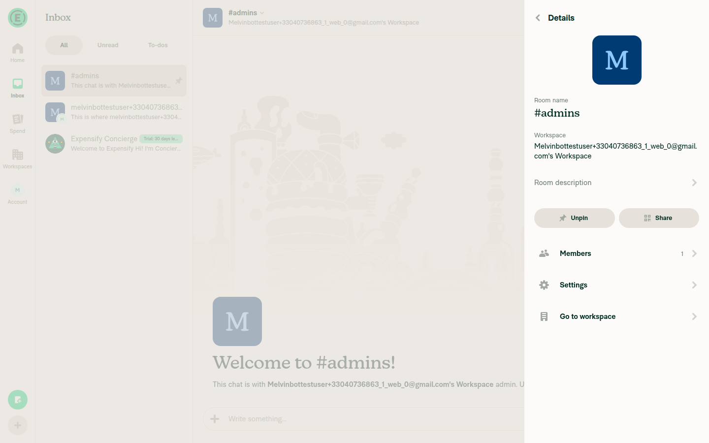
Rounded-square workspace avatar

Members list hover attempt (no tooltip appeared)
Hover attempt, no tooltip

Note: I wasn't able to run jest/tsc locally in this environment, so I reviewed the test changes (AvatarTest.tsx, GroupChatNameTests.tsx) by reading — the AvatarFromIcon/UserAvatar/WorkspaceAvatar mock migration looks correct. Rely on CI for the definitive pass.


view run

@MelvinBot

Copy link
Copy Markdown
Contributor

Regression hunt

Verdict: no functional or build regressions found. The refactor is faithful — I traced every migrated call site and the border-radius math, and ran a runtime avatar sweep on web. One genuinely-changed behavior (a lost source fallback) is worth a look but is low-impact.

What I checked (all clean)

  • No orphaned facade imports. The deleted Avatar/index.tsx has zero remaining importers — nothing imports @components/Avatar or the old relative '..' anymore, so no build break.
  • Border-radius is byte-identical. getAvatarBorderStyle now inlines the radius, but produces exactly what the old getAvatarBorderRadius(size, type) did: ROUNDED_SQUARE → avatarBorderSizes[size], everything else → variables.buttonBorderRadius. All 12 non-primitive callers pass AVATAR_SHAPE.CIRCLE, and each previously passed ICON_TYPE_AVATAR or '', which mapped to that same rounded default — no caller previously passed ICON_TYPE_WORKSPACE, so nothing loses its rounded-square. The wrapper-level getAvatarBorderRadius(size, icon.type) calls (Horizontal/Diagonal/RoomHeader/Attendees) are untouched and still shape by icon.type.
  • AvatarFromIcon fork matches the old facade (icon.type === ICON_TYPE_WORKSPACE), and getAccountIDFromAvatarID(undefined) returns DEFAULT_NUMBER_ID, so dropping the explicit avatarID ?? DEFAULT_NUMBER_ID at call sites is safe. name, fallbackIcon, fill, testID all still flow through the icon object / separate props.

🔸 One real behavioral change (low impact)

BaseUserDetailsTooltip/index.tsx:63-74: the old code did source={icon?.source ?? userAvatar}, so an icon with a falsy source still fell back to the resolved userAvatar. The new icon branch only fallbacks id/name, not source — so a user icon with an empty source now resolves the default avatar from accountID instead of userAvatar. Unlikely in practice (icons normally carry a source), and arguably more correct for workspace icons, but if you want strict parity add source: icon.source || userAvatar to the spread.

🧪 Runtime sweep (web) — 3/4 pass, 1 inconclusive

Surface Status Observation
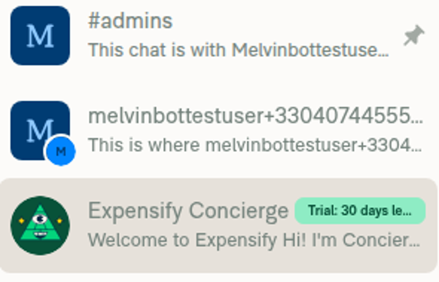
LHN rows (user circle / workspace rounded-square + subscript badge) ✅ pass #admins rounded-square, workspace chat rounded-square + circular badge, Concierge circular — none blank/broken
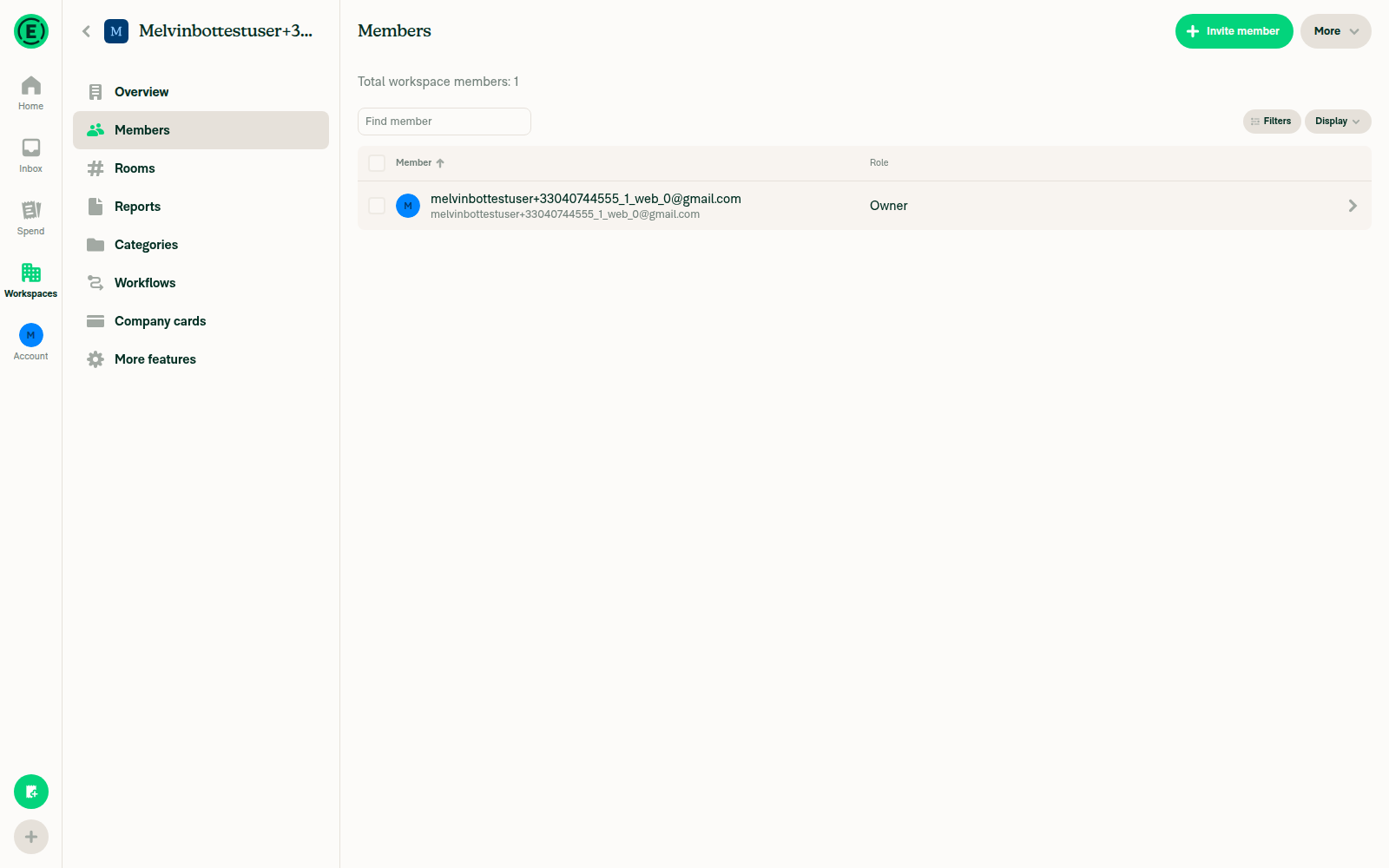
Member/participant list avatars ✅ pass Member rows show correctly circular user avatars, no missing images
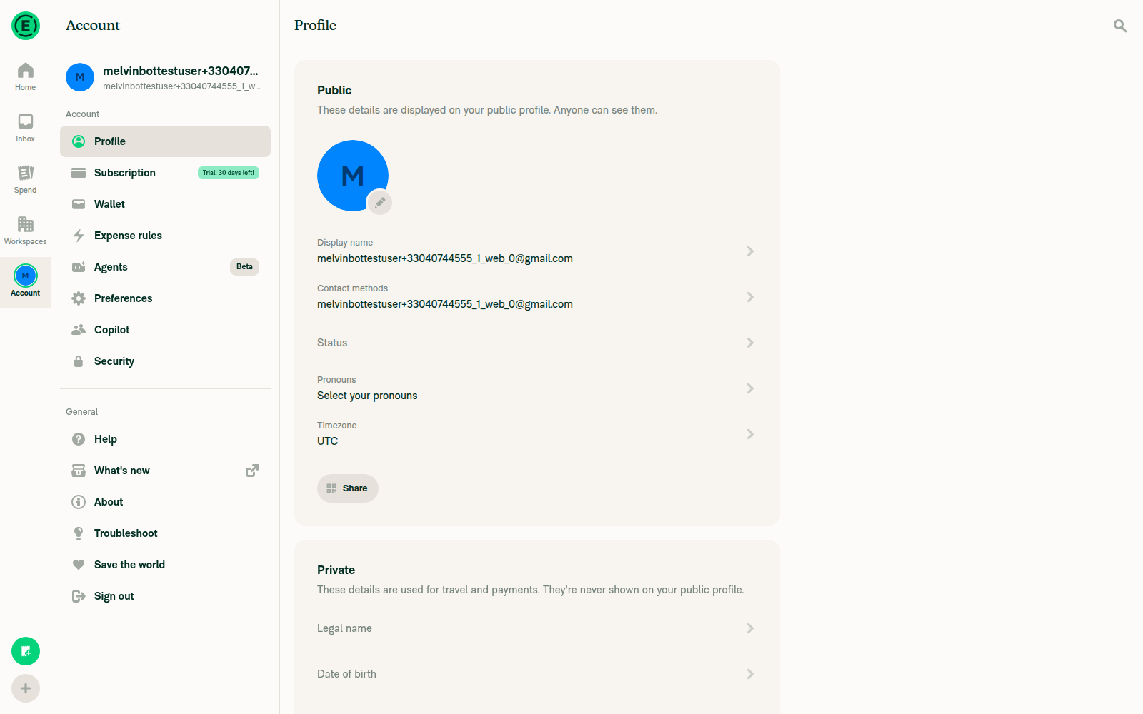
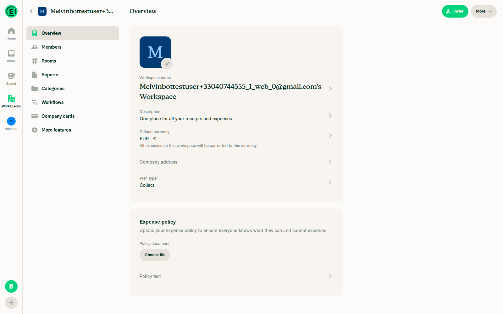
Profile (circle) + workspace details (rounded-square) ✅ pass Profile avatar circular, workspace avatar rounded-square, correct default letter-avatars
Hover sender avatar → user-details tooltip ⚠️ inconclusive Tooltip never appeared, but the tester confirmed no hover-gated UI (message toolbar, LHN hover) fired either — hover events don't register in this headless session, so this isn't avatar-specific. This is the one path with a real code change above — please spot-check the tooltip manually in a browser.
Screenshots

LHN rows — workspace rounded-square + circular subscript badge, Concierge circular
LHN rows

Workspace Members list — circular member avatar
Members list

Account profile — circular user avatar
Profile avatar

Workspace Overview — rounded-square workspace avatar
Workspace overview avatar

Hover attempt — no tooltip (hover not registering in headless session)
Hover attempt, no tooltip

Note: jest/tsc couldn't run in this environment, so verify the two test files (AvatarTest.tsx, GroupChatNameTests.tsx) via CI. Net: I found no regression that would break rendering — just the one low-impact tooltip source-fallback change to confirm.


view run

@jmusial

jmusial commented Aug 27, 2026

Copy link
Copy Markdown
Contributor Author

@aimane-chnaif all updated

@roryabraham
roryabraham merged commit e5d439d into Expensify:main Aug 31, 2026
34 of 35 checks passed
@github-actions

Copy link
Copy Markdown
Contributor

🚧 roryabraham has triggered a test Expensify/App build. You can view the workflow run here.

@OSBotify

Copy link
Copy Markdown
Contributor

🚀 Deployed to staging by https://github.com/roryabraham in version: 9.4.65-0 🚀

platform result
🕸 web 🕸 success ✅
🤖 android 🤖 success ✅
🍎 iOS 🍎 success ✅

@MelvinBot

MelvinBot commented Aug 31, 2026 •

Copy link
Copy Markdown
Contributor

No help site changes are required. I did not create a docs PR.

This PR is an internal refactor of the Avatar component tree. Nothing a customer sees or does changes, so no article under docs/articles is affected.

How I checked

What the PR actually changes

Change User-facing?
Added src/components/Avatar/AvatarFromIcon.tsx to render an avatar from an Onyx Icon entry No — internal component
Deleted the legacy Avatar/index.tsx facade and dropped the type prop from the avatar API No — internal API
Added CONST.AVATAR_SHAPE (CIRCLE / ROUNDED_SQUARE); primitives now take shape instead of type No — internal constant
Migrated call sites to AvatarFromIcon No

The PR's own test steps only ask a reviewer to confirm avatars still render the same way they do today — round for people, rounded square for workspaces. That is the existing behavior, not new behavior.

Docs I ruled out

Five articles mention avatars. None of them describe the component internals this PR touches:

Other signals

  • No src/languages/*.ts file is touched, so no user-facing copy changed.
  • No settings, tab, menu, or button was added, renamed, or removed.
  • No docs/ file is touched by the PR.

@jmusial, there is no linked help site PR because no article needs updating. If you think a doc should change anyway, reply with what you'd like documented and I'll open the draft PR.


view run

Evidence (1)

Recordings

- [▶ Session recording of the verification run](https://melvinbot-assets.exops.io/session-33427886495-1-6c96d648-9912-4c92-80b6-562778e45319.webm)

@OSBotify

OSBotify commented Sep 2, 2026

Copy link
Copy Markdown
Contributor

🚀 Deployed to production by https://github.com/francoisl in version: 9.4.65-3 🚀

platform result
🕸 web 🕸 success ✅
🤖 android 🤖 success ✅
🍎 iOS 🍎 success ✅

Bundle Size Analysis (Sentry):

Sign up for free to join this conversation on GitHub. Already have an account? Sign in to comment

Labels

None yet

Projects

None yet

Development

Successfully merging this pull request may close these issues.

5 participants