
This is a custom Insight Panel component, that was built to display a user's new and saved insights on a section of a web app. It is built with React + Typescript, and comes with some tests to make sure everything does what it needs to do.
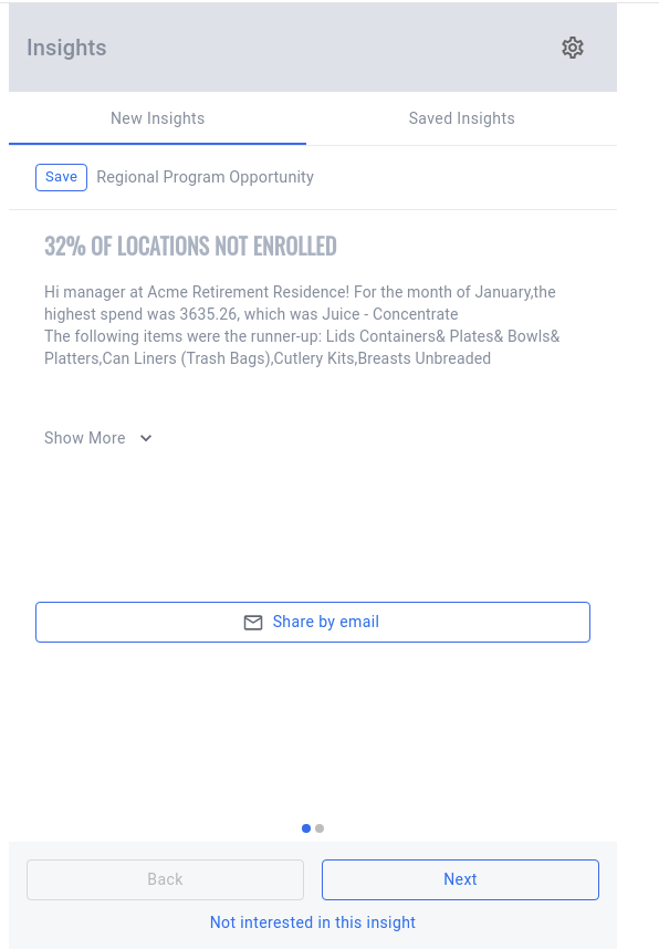
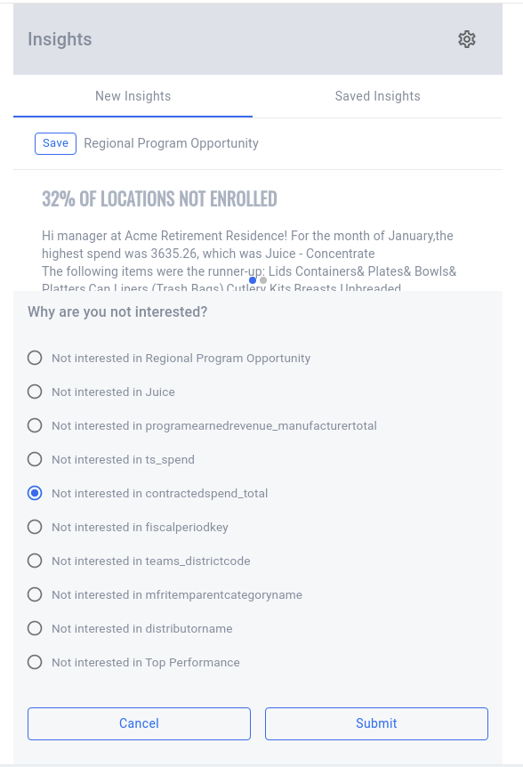
The component is broken down into many sub-components as it gives it the ability to be pieced together as needed. What you see below is the 'fully loaded' version of this component, but there are instances where not every 'sub-feature' is required. For instance, not always will the component need to have the footer or the share button, and separating them out into their own component makes it trivial to remove them in those cases.
In src/InsightsPanel/InsightsPanel.stories.tsx you will see a sample usage of the component.
 <InsightsPanel insights={SAMPLE_USER_INSIGHTS} savedInsights={[SAMPLE_USER_INSIGHTS[1]]}>
      <InsightsPanelHeader title="Insights">
        <IconButton aria-label="insights preferences">
          <SettingsOutlinedIcon onClick={handlePreferencesClick} />
        </IconButton>
      </InsightsPanelHeader>
      <InsightsPanelTabs />
      <InsightsPanelInsight onAction={handleInsightAction} />
      <InsightsPanelShare onShare={handleInsightShare} />
      <InsightsPanelFooter onUninterested={handleUninterested} />
    </InsightsPanel>
The insights are passed in to the parent InsightsPanel component. Each child of this component then has access to these insights and the overall state of the component with the power of React context.
If you would like to add features to this component, simply create a new component, and import useInsightsPanel. This will give any child access to the state of InsightsPanel, and the ability to dispatch new events to the state. If you want to remove features, just simply omit them when building this component.
In the project directory, you can run:
Will install all the dependencies needed to view the project
Will build and run a local copy of Storybook. This will show you a live preview of how the Insight component works.
Launches the jest test runner.
Launches the jest test runner in watch mode
Builds the app for publishing to the dist folder.
Uses esbuild to bundle the code, typescript to create types for the component and ts-alias to convert aliased paths into relative paths.
Also creates a separate package.json file which is included in the dist folder.