Repository navigation
feat(web): Prism, a chrome-and-glass theme - #141
Conversation


A new built-in theme in the spirit of liquid chrome on black: an ink-black
(or pearl) canvas lit by iridescent refractions, silver controls, an
electric-blue accent, and glassmorphism throughout. The palette itself
stays opaque so the theme editor, exports, and mobile read it like any
other theme; the web stylesheet adds the glass: the body paints one static
scene (blue-to-violet sweep, gold edge, chrome ribbons, a few sparks) and
every pane over it is a translucent tint of its palette color, with blur
limited to the sidebar, the thread toolbar, the composer, and the popups
that already carry it. The wordmark is set in chrome, and browsers without
backdrop-filter fall back to the opaque palette.

Also carried: the boot-splash copy in index.html, the maintainer card in
Settings → Appearance, and the mobile theme list in the docs.

Co-Authored-By: Claude Fable 5.1 <noreply@anthropic.com>

Codex Review SummaryThis comment shows the latest Codex review activity on this pull request.
ℹ️ About Codex in GitHubYour team has set up Codex to review pull requests in this repo. Reviews are triggered when you
Codex reacts with 👀 while any review is running, comments if it has suggestions, and reacts with 👍 once all reviews finish with no findings. |

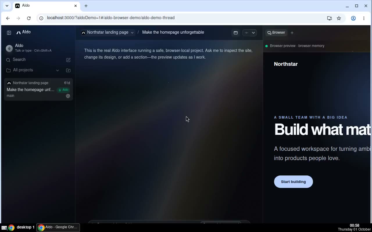
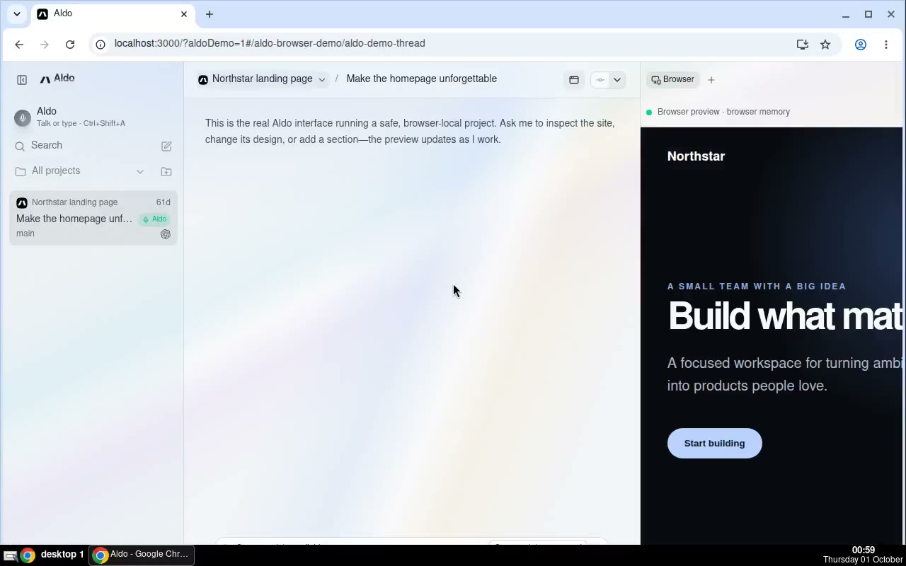
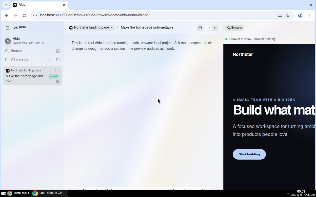
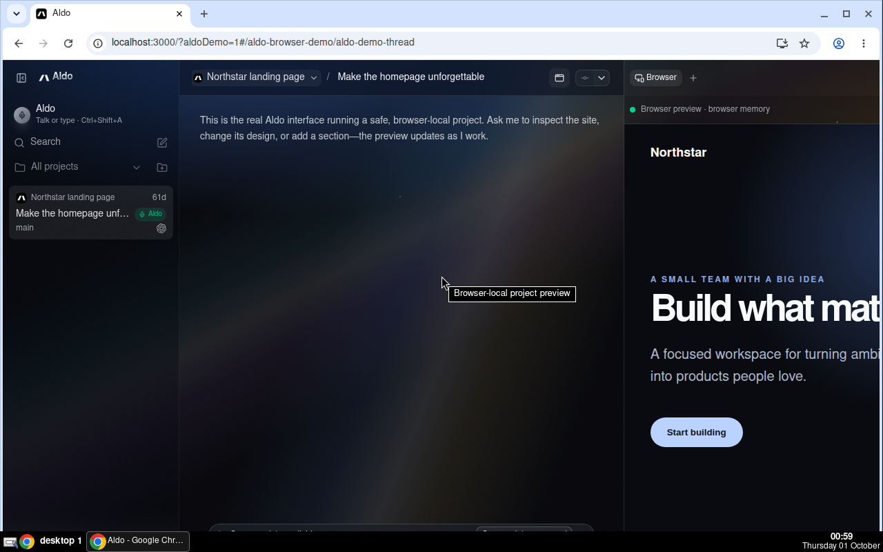
🎬 DemoPrism in the Aldo dev app: the demo thread in dark mode, Settings → Appearance switching to light, and both modes of the thread view Recorded by the agent in its Aldo sandbox. |
![chatgpt-codex-connector[bot]](https://avatars.githubusercontent.com/in/1144995?s=60&v=4)

There was a problem hiding this comment.
💡 Codex Review
Here are some automated review suggestions for this pull request.
Reviewed commit: 91723a8175
ℹ️ About Codex in GitHub
Your team has set up Codex to review pull requests in this repo. Reviews are triggered when you
- Open a pull request for review
- Mark a draft as ready
- Comment "@codex review".
If Codex has suggestions, it will comment; otherwise it will react with 👍.
Codex can also answer questions or update the PR. Try commenting "@codex address that feedback".
| @@ -1,4 +1,4 @@ | |||
| export const BUILT_IN_THEME_IDS = ["t3-chat", "grove", "ocean", "ember", "iris"] as const; | |||
| export const BUILT_IN_THEME_IDS = ["t3-chat", "grove", "ocean", "ember", "iris", "prism"] as const; | |||
There was a problem hiding this comment.

Adding prism here also exposes it in the mobile theme picker, where getMobileUniwindThemeName produces prism-light or prism-dark; however, apps/mobile/generated-uniwind-theme-names.json still registers only the previous themes with Metro, and generated-uniwind-themes.css contains no Prism variants. Selecting Prism on mobile therefore requests an unregistered theme and cannot apply its variables. Regenerate and commit both outputs, and update the generator test's expected names.
AGENTS.md reference: AGENTS.md:L23-L31
Useful? React with 👍 / 👎.
| accent: "oklch(0.58 0.19 262)", | ||
| accentForeground: "oklch(0.99 0.002 255)", |
There was a problem hiding this comment.

On mobile, createMobileThemeVariables maps these roles directly to --color-primary and --color-primary-foreground, which are used together on normal-sized button labels throughout the app. After conversion to native sRGB, these values are approximately #3672e9 and #fbfcfd, yielding only about 4.31:1 contrast rather than the 4.5:1 required for this text size; the existing built-in contrast test omits this role pair. Darken the light accent or its foreground so Prism's mobile primary actions remain readable.
AGENTS.md reference: AGENTS.md:L65-L70
Useful? React with 👍 / 👎.
| @supports not ((-webkit-backdrop-filter: blur(1px)) or (backdrop-filter: blur(1px))) { | ||
| html[data-theme-id="prism"]:root, | ||
| html[data-theme-id="prism"] [data-app-sidebar] { |
There was a problem hiding this comment.
In browsers or embedded webviews without backdrop-filter, this fallback restores opaque variables only for the root and sidebar, but the Prism composer still overrides --chat-composer-glass-surface with a color mixed to 72% over transparency. ComposerSurface's own no-support rule then uses that already-translucent value as its supposedly solid background, allowing scrolling message content to show through the floating composer and reducing legibility. Include the composer variable in this fallback and reset it to var(--app-theme-surface-raised).
Useful? React with 👍 / 👎.
| @@ -1,4 +1,4 @@ | |||
| export const BUILT_IN_THEME_IDS = ["t3-chat", "grove", "ocean", "ember", "iris"] as const; | |||
| export const BUILT_IN_THEME_IDS = ["t3-chat", "grove", "ocean", "ember", "iris", "prism"] as const; | |||
There was a problem hiding this comment.
Before this commit, prism was a valid custom-theme ID. Adding it to BUILT_IN_THEME_IDS also adds it to RESERVED_THEME_IDS, so parseStoredTheme now drops any previously saved custom theme with that ID, while the boot script and getThemeDefinition resolve the stored preference to the new built-in instead. A user who already created or imported a theme named Prism will silently see a different theme and can no longer edit or export their saved one through the UI. Migrate conflicting stored IDs and their preferences, or choose a built-in ID that cannot collide.
Useful? React with 👍 / 👎.
Review follow-ups: the generated Uniwind theme outputs now carry Prism so
the mobile picker can apply it; the light accent is darker so primary
button labels keep 4.5:1 on mobile (and the test now checks that pair for
every built-in); and the no-backdrop fallback also restores the opaque
composer surface.

Co-Authored-By: Claude Fable 5.1 <noreply@anthropic.com>
|
Thanks, Codex. Addressed in f0d51bb:
Custom themes already named "prism": leaving this as is. The id namespace is shared by design, and every built-in added before this one (grove, ocean, ember, iris) took its id the same way; a migration for stored ids plus the boot script's copy is more machinery than the case warrants. Reserved ids are refused at save and import time, so the only affected user is one who saved a theme named exactly "Prism" before this release, and their theme file stays importable under another name. |

1 participant

What
A new built-in theme, Prism: liquid chrome on black (and on pearl in light mode), with glassmorphism throughout. It sits next to Grove, Ocean, Ember and Iris in Settings → Appearance.
packages/shared/src/themePalettes.ts): ink-black / pearl canvas, silver controls, electric-blue accent, gold and violet as the warm and cool refractions. Light base with a dark variant like the other built-ins, so mobile and the boot splash pick it up unchanged. The palette itself stays opaque so the theme editor, exports, and mobile read it like any other theme.apps/web/src/index.css): the body paints one static scene (a blue-to-violet sweep, gold at the right edge, cyan under the sidebar, a lit spot behind the composer, two chrome ribbons with iridescent edges, a few sparks). Every pane over it is a translucent tint of its palette color, with specular top edges and hairline borders. Blur is limited to the panes that float over other content: the sidebar, the thread toolbar, the composer, and the popups that already carry it, so nothing re-blurs on every frame beyond what the app does today. The wordmark is set in chrome. Browsers withoutbackdrop-filterfall back to the opaque palette.index.html(checked by the existing sync test), the maintainer card in Settings, and the mobile theme list in the docs.How it was tested
vp test run src/themePalette.test.ts src/themeBoot.test.ts(web) andsrc/lib/mobileTheme.test.ts(mobile, contrast checks on every built-in) pass.tsgo --noEmitinpackages/sharedandapps/web;vp lintandvp fmt --checkon the changed files.VITE_ALDO_CLOUD=1and run in the Aldo dev app: Settings → Appearance, the home page, a dialog, and the demo thread (composer, toolbar, sidebar, right panel) in both modes. Recording and screenshots in the comment below.Done with Claude Fable 5.1 in Claude Code.
🤖 Generated with Claude Code