Repository navigation
Conversation


|

3dc1aa8 to
9a915bc
Compare
|
@catarak I think this is looking much better. Do you think we need a background image as in the design? I can't seem to extract that one from the Sketch file.
|
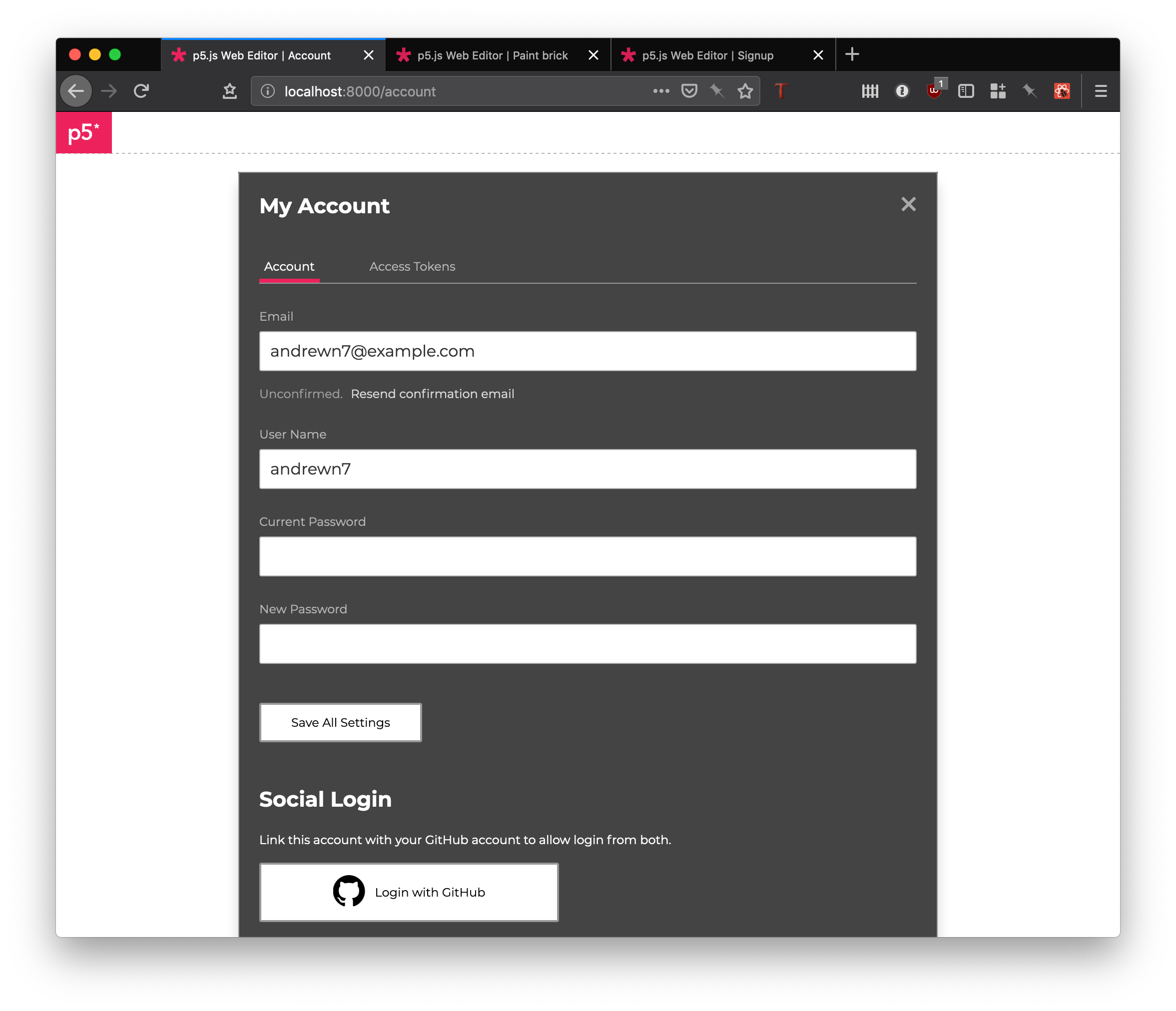

I think the idea behind that design is that there would be a p5.js sketch running in the background, like the p5.js website. I think it makes sense not to include that for the settings page! |
|
Ah, ok. Yeah, I think it would be distracting to have all sounds and movement on these pages. I'll leave it blank for now as I don't want to spend too much more time on this. |
|
This is looking good! A few things:
|

8ca8a3a to
044f965
Compare
|
I just cherry-picked the commits on top of As I force-pushed, you'll probably want to delete any local copies of this branch to avoid things getting weird. |
044f965 to
a39cc61
Compare
|
I just cherry-picked the commits on top of As I force-pushed, you'll probably want to delete any local copies of this branch to avoid things getting weird. |
a39cc61 to
2916b52
Compare
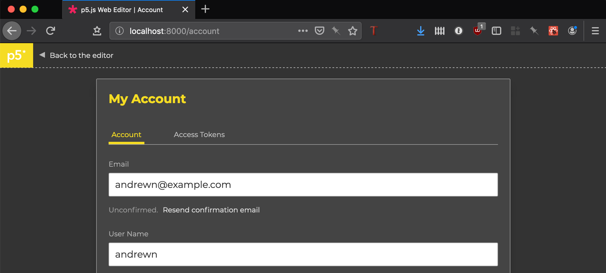
The designs have Back to the editor call out instead of an "X" so I implemented this. What do you think?
👍 ✅ |
|
i think this looks a lot better, and is ready to merge! |


Currently, "user" pages like Log In, Sign Up, Account Settings and re-usable like
formandform-containerare not theme-aware.This makes it difficult to reuse CSS across the app. For example, the striped tables in #1075 are theme-aware, but the colours are wrong when embedded in the Account page.
This PR:
I have verified that this pull request:
npm run lint)Fixes #123